
Portfolio Management Software Redesign.
Business scope, research, analysis, ideation and prototyping.
Outdated website experience was hurting user engagement and retention.
The client's outdated website design was turning away potential customers and reducing user engagement, leading to lower sales and brand image. They needed a fresh, modern design to revamp their online presence and attract more visitors.
Revamp website to increase user engagement and improve brand image.
Complete rework of experience and user interface.
Effective and efficient UIUX redesign.
By incorporating modern design elements, our website saw a significant 30% increase in user engagement. The fresh, user-friendly layout attracted more visitors, increased user satisfaction and ultimately led to higher conversions.
The Brief
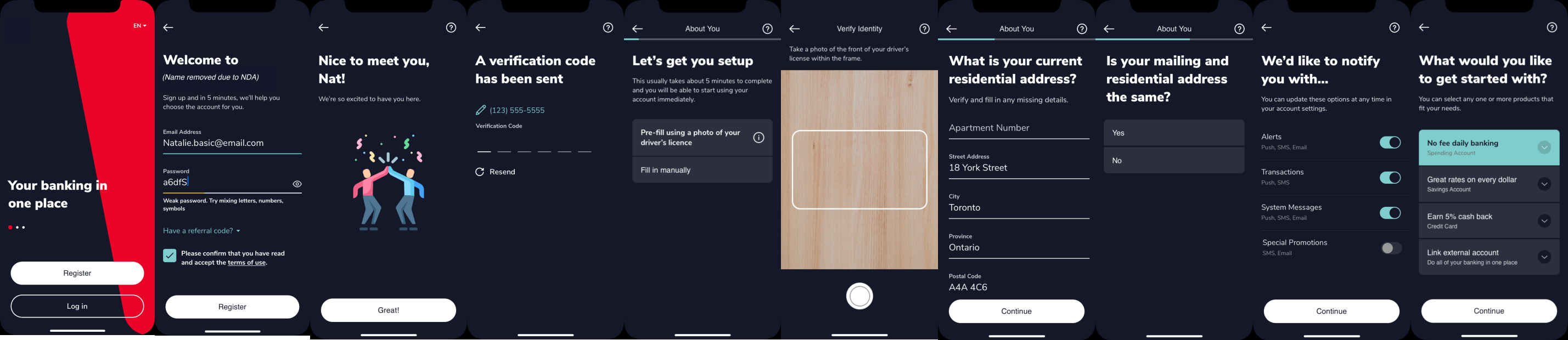
A major airline in North America reached out to our team to engage on a new project to launch a brand new cobranded travel rewards credit card that will be released in 2025.
My team consisted of me, a content designer, a user researcher and a design manager.
My team's business directors then reached out to us to ask us to start on the project. This was near end of March, and our deadline to deliver a hi-fi prototype was May 15. We have no requirements, context, information or any business planning done at this stage. All we knew was we needed to create an experience that allowed users to signup to this new credit card during their booking flow from the partner website which then took them to our flow to complete the credit card signup.
Market and Competitive Research
Since i had no information to work from, i had to start by looking at what others are doing. I started looking at different airlines in North America to click through their flows of booking flights, seeing if they had any experiences in which they pushed a cobranded bank credit card. Then i looked up banks in North America, with a focus on Canadian banks to see if how they managed their credit card signup experiences and if they offered any cobranded products during these flows. I then compiled screenshots of each company into a Figjam board to gather my research with post-its, explaining the key points to call out. From this i compiled a summary table of key findings.
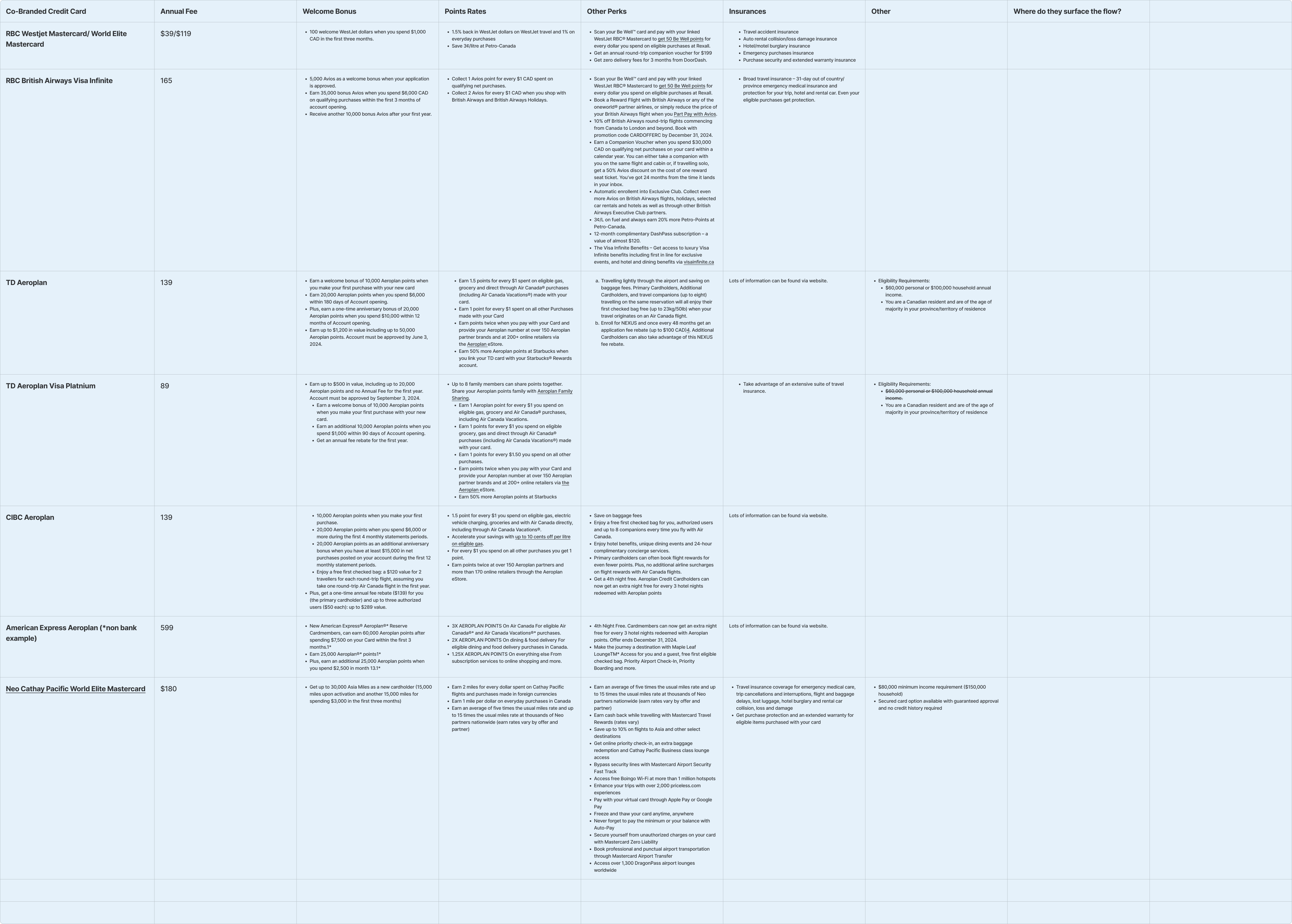
I presented the summary table to stakeholders, this helped them get an understanding of what the industry is offering. The next step for me was to create a quick flow for moderated user testing to see if any of the ideas that came up from the market were received well. The main idea i wanted to test was the entry points into BMO's credit card application flow through a promotional card on specific pages of Porter's flow.
User Testing
I audited Porter's current flight booking flow and thought of where i can surface a promotion to encourage Porter customers to apply for the new cobranded BMO Mastercard. I created a promo card for the new Mastercard and injected it into different parts of Porter's flow to visualize. I then presented this to my business stakeholders to get their feedback. Then i engaged our user researcher for this project to prepare a quick prototype using a Figma kit for user testing to gather qualitative data on these promo locations. The copy was written by a content designer who worked with me on this project. I had to do this to start generating ideas for the business, to give them something to work from.
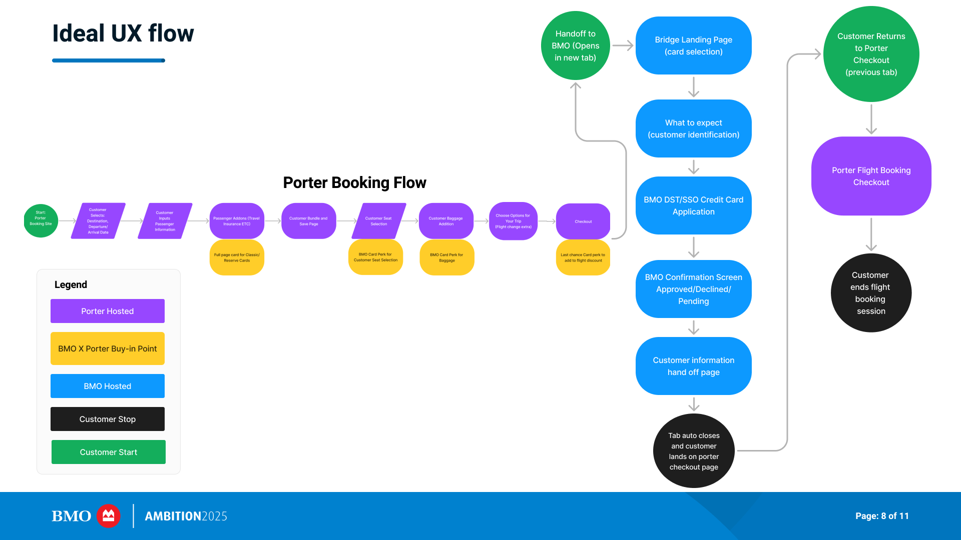
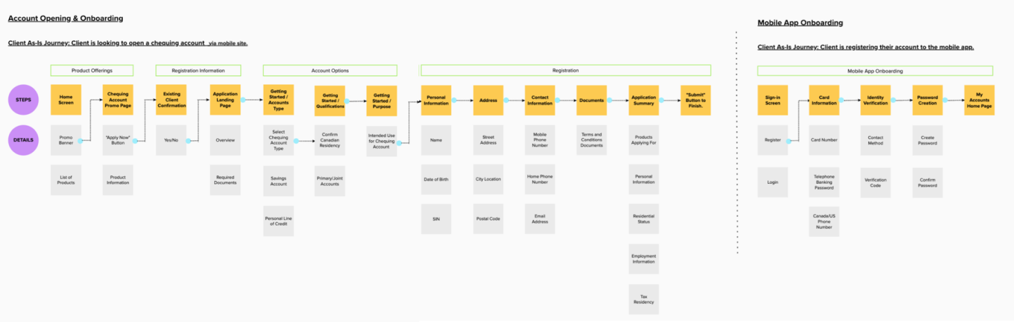
The current Porter flight booking flow with my BMO promotion card idea is shown below. I surfaced the card on pages of potential benefit to the user such as baggage options, seat selection, all things our card can potentially provide in value.
Below is a user flow of how the experience will look like when connected with Porter's booking flow.
Moderated User Testing
I could not disclose Porter's information during the test, so i had to use a quick hi-fi Figma kit for testing purposes only to test the idea of promotional cards for Porter users to enter the BMO application flow.
Some ideas that was tested were:
- Promotional banners of the new credit card throughout the Porter flight booking flow.
- Ability to save your previous flight search within Porter even if you are looking on a new booking.
- Intermediary page to transition to BMO.com credit card application flow after user selects "Apply and Book" on the promotion.
- Top page banner on BMO.com credit card application flow that saves their Porter flight booking and allow user to return to it.
After the research was done, my team and i compiled a PDF to share out to rest of the team to lead them onto what we should do as requirements for this project.
Project Requirements Workshop
After we presented the findings and the ideas to business stakeholders, i created a Figjam workshop to start ideating on what possible requirements we need to design for in our new flow. This involved people from business and management as well. From this the business was able to create a Design Requirements Scope document (DRS) from in which to submit as official requirements for this project to upper management.
May 15 Handoff
This deadline was to create something to work from to our business as requirements, which was met. The BMO team met the Porter design/business/dev teams on this day in a meeting and i passed on the Figma files to them after i gave them a run-through of the project. This helped Porter start thinking about how they wanted to surface the BMO card promotions in their flows and how our two companies can be connected.
I met with the content designer and design manager to plan out next steps of the project, create a Wishlist of features we want built and laid out all the entry points of this experience from both Porter and BMO. The next phase will be split into MVP1 and MVP2. MVP1 being only entry from BMO and applying for the card. MVP2 being entry from Porter, apply to card via BMO and use the new card's welcome offer to finish flight booking on Porter.com.
Retro
I created a Retro to get feedback from the user reseacher, content designer, content design manager, design manager and director on what we thought went well, bad and can be improved upon.
Phase 2
Iteration
I started to ideate on the ideas and Wishlist items that came out from the requirements workshop. Below is an exploration of the timer idea on Porter and BMO flows.
Timer Iterations
I expanded upon my original idea of a timer and created two versions, one with live timing and one without, since the business and tech leads weren't sure if we could do live time tracking yet.
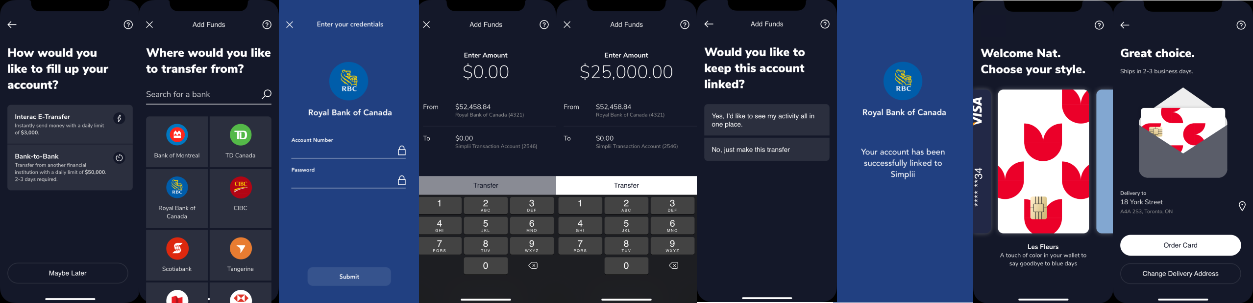
VIPorter BMO Page
I created a new page to showcase VIPorter account number for people that logged in from Porter.com first then came to BMO via the credit card promotion.
If they start at BMO.com they are able to input their VIPorter account so when they open this card they automatically get this promotion on their next flight in Porter.com.
If they start on Porter.com and they are already logged in to VIPorter once they get to BMO so the field on BMO side becomes read only.
Confirmation Pages
I designed new confirmation pages to include a card that highlights information pertaining to Porter and the credit card. I worked with my content designer to finalize the copy.
Finalized Timer Design
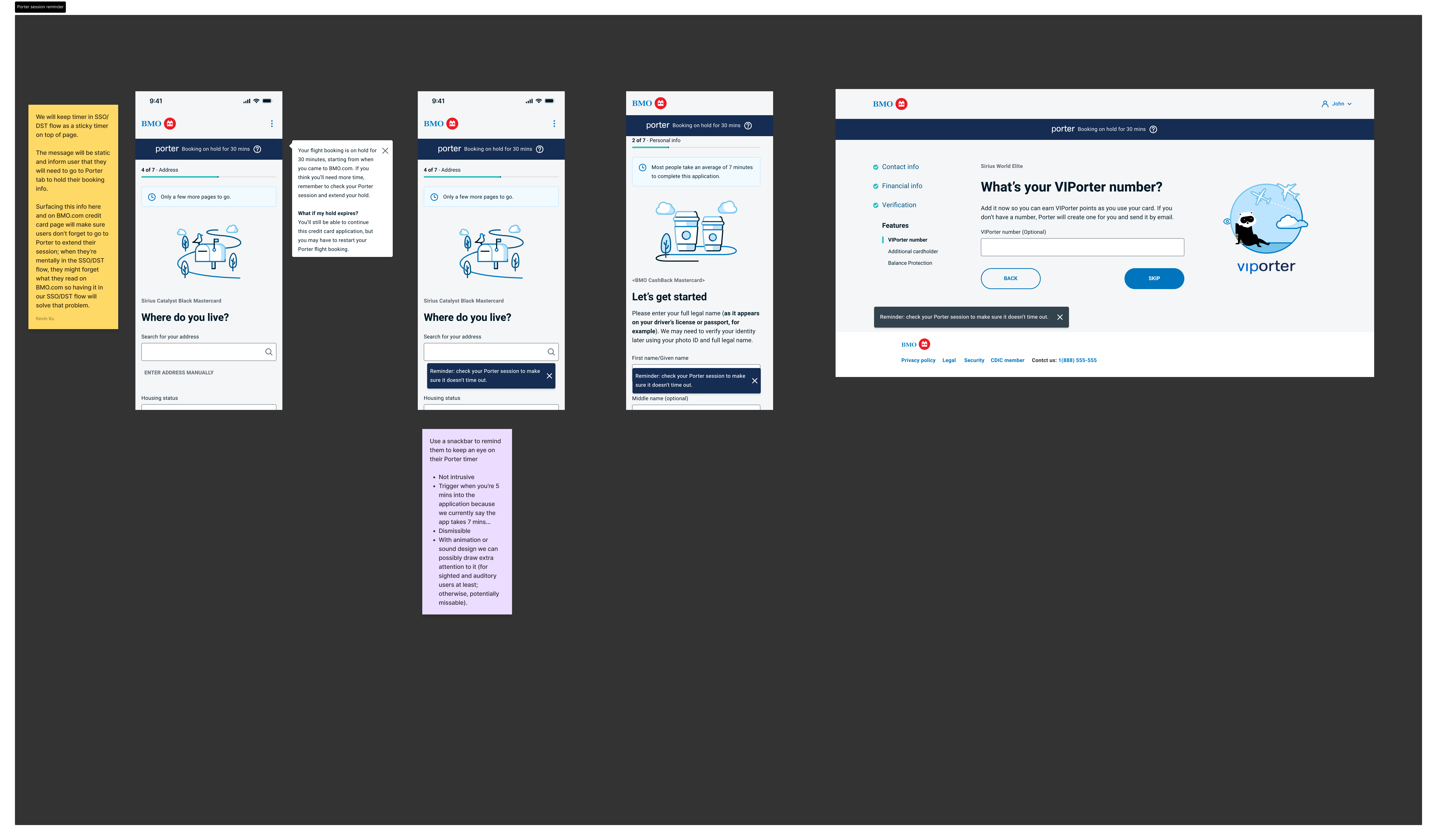
After back and forth with the tech teams and business, we finally aligned on a feasible solution to be implemented. There will be no live timer due to inability to track Porter's session time from BMO side. I had to go with the static timer copy since we cannot update the component with live time. 30 minutes is how long Porter holds their current flow sessions, so this has to be reflected on our side as crucial information. A snackbar prompts at 5 minutes to remind users that their time is about to run out to hold their Porter booking information and they should go back to refresh their Porter session.
Upsell Design and User Testing
When user inputs their income in our Employment field, after they click Next on the page, there will be an upsell slide panel to allow users to compare their card options and apply for a better card if they wish.
I designed three more versions to see which users preferred the most out of the four options. One to compare with another card, one to show the other two cards but not current and one to only show one card with no comparison. The result was most users still preferred to see all three options compared.
After all hi-fi designs were completed, i created two prototypes of MVP2 in Mobile and Desktop.
Final Prototypes: Mobile
I handed off the mobile and desktop flows to Porter on October to complete our project. The marketing page is owned by another team and will be completed sometime this year. Due to legal reasons i cannot show Porter's newly designed flow, so i put the screen i tested originally below to show you the entry point into BMO's application flow.
Final Prototypes: Desktop
Next Steps
I gave the prototypes and their Figma files to Porter in a shared folder across our two companies. The Upsell experience will be developed in 2025 and the marketing bridge page between Porter.com and BMO.com will be done by 2025. BMO is currently in the process of hiring developers to fully implement the new flows by end of 2025. We are in the process of setting up quantitive metrics tracking software Google Analytics on the flow, tracking things such as Conversation Rate, Task Success Rate will be sending out surveys in the future.
As of April 2025, this is now live! You can apply for the cards on Porter's homepage: https://www.flyporter.com/en-ca/ or BMO's credit card page: https://www.bmo.com/en-ca/main/personal/credit-cards/travel/.
Market Research
After the business and i identified the scope, we started to look around the market in different countries using a internal tool that allows use to see different banking apps across different Western countries.
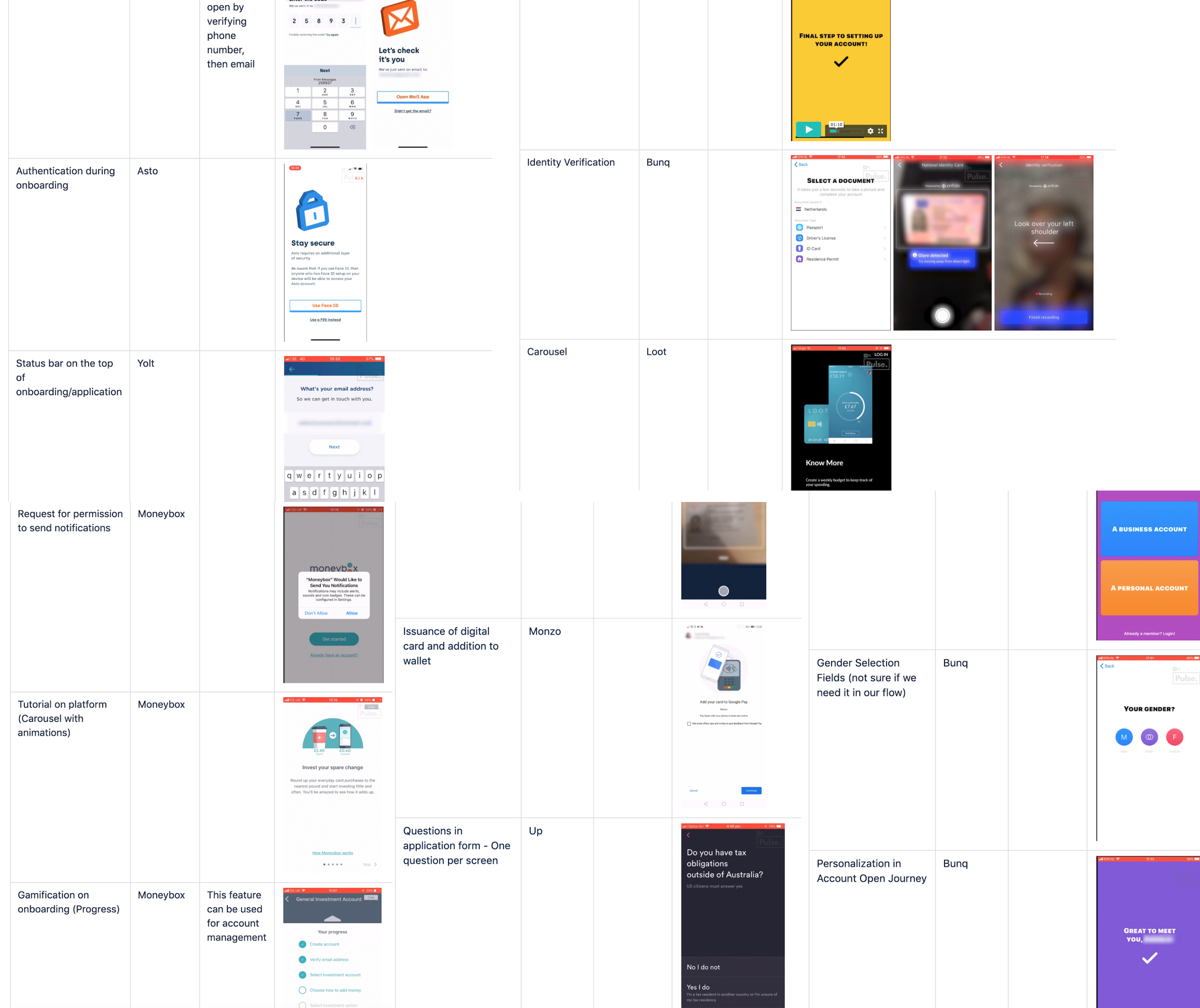
User Research
I created a Persona based on past interviews and surveys the business strategists had done.
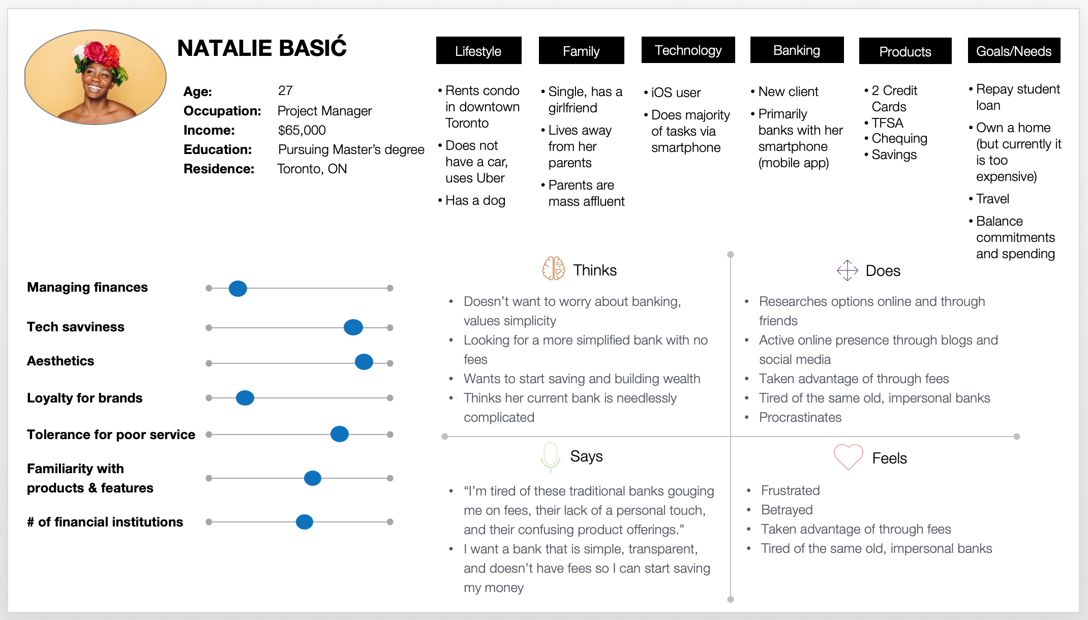
- Thinks her current bank is needlessly complicated and confusing.
- Doesn’t want to worry about her banking, just wants to get things done as smooth as possible.
- Wants to start building savings for future large purchases.
- Dislikes how Canadian banks feel impersonal and cold.
- Does not want fees on her bank accounts.
Ideation
For each journey, i conducted two workshops to understand what we need to build and why. The workshop looks at user research data on current pain points of users who fit our persona and their feedback upon completion of a journey with our existing app’s on-boarding process.I created this board and asked my pod what the user is doing, thinking and feeling as they go through on-boarding. The ideas from this board are used to identify pain points and leads to the next workshop, Solutions Ideation.
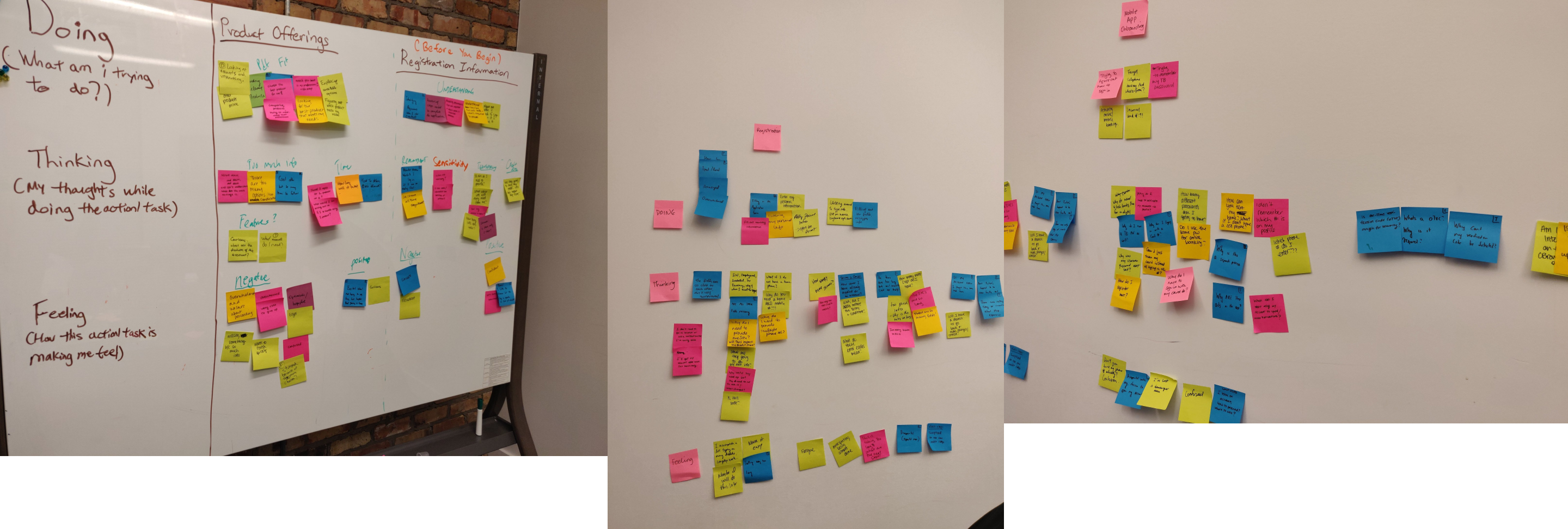
- Why does the experience feel so tedious to complete?
- Too much information required to open an account; doubt that some required information is even required.
- Not sure how long the on-boarding process will take.
- Have to mail or go to Canada post to complete account opening.
- Why does the mobile app’s on-boarding take me to an external registration website?
The Problem
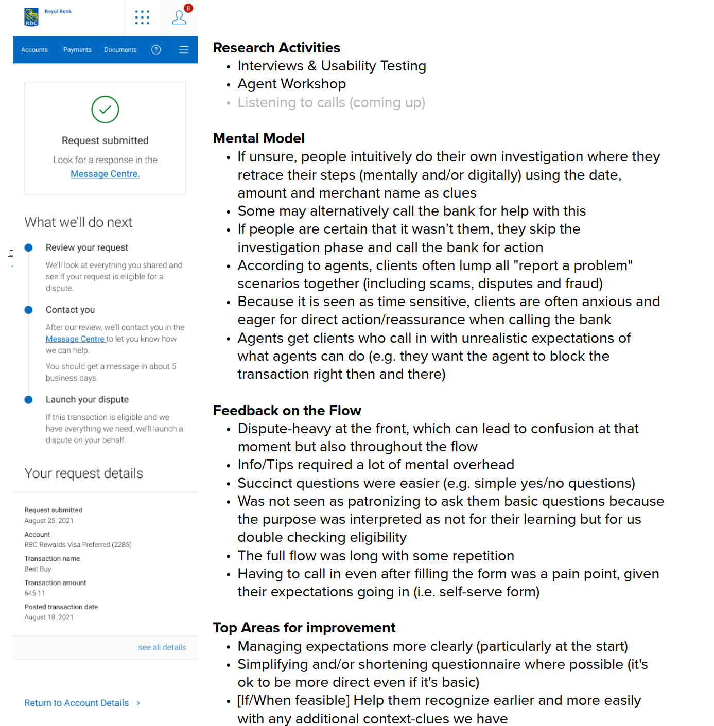
There is an overloaded amount of calls to call center advisors for support that users can solve on their own, especially when it comes to reporting disputes and frauds on credit card transactions. Currently, the bank is handling these support requests very slowly due to the sheer number of calls support advisors get. Even though a current flow for reporting fraud or disputing transactions exists, most users are not using it. The bank needs a better self-serve method online for users to self report their issues so call advisors don't have to. I created a plan after gathering a sense of things through interviewing the business stakeholder and working with him to get answers. i used Mural to work with the stakeholder in many workshops to get onto paper, our brainstorming, ideas and knowledge of how this process works and might work after improvements.
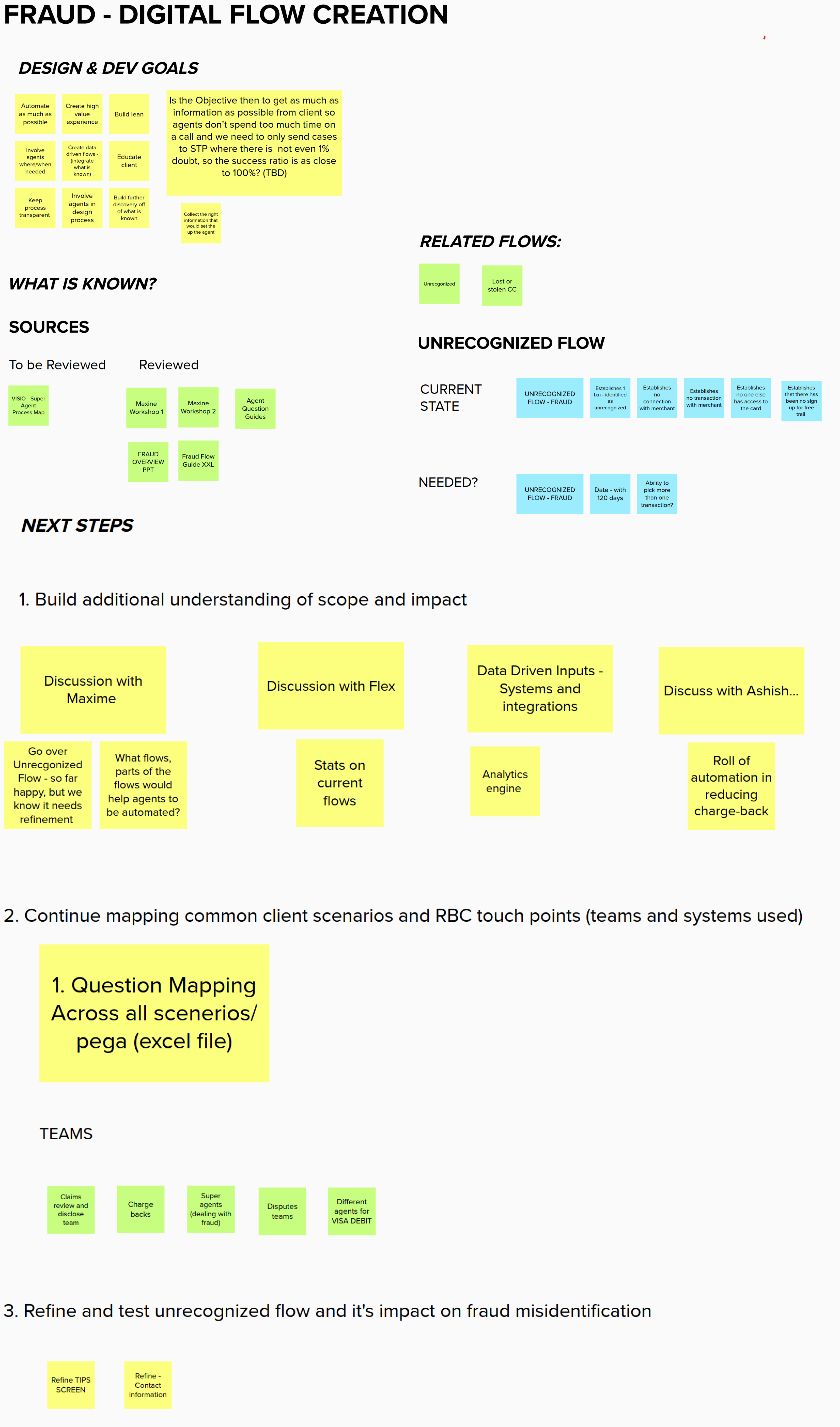
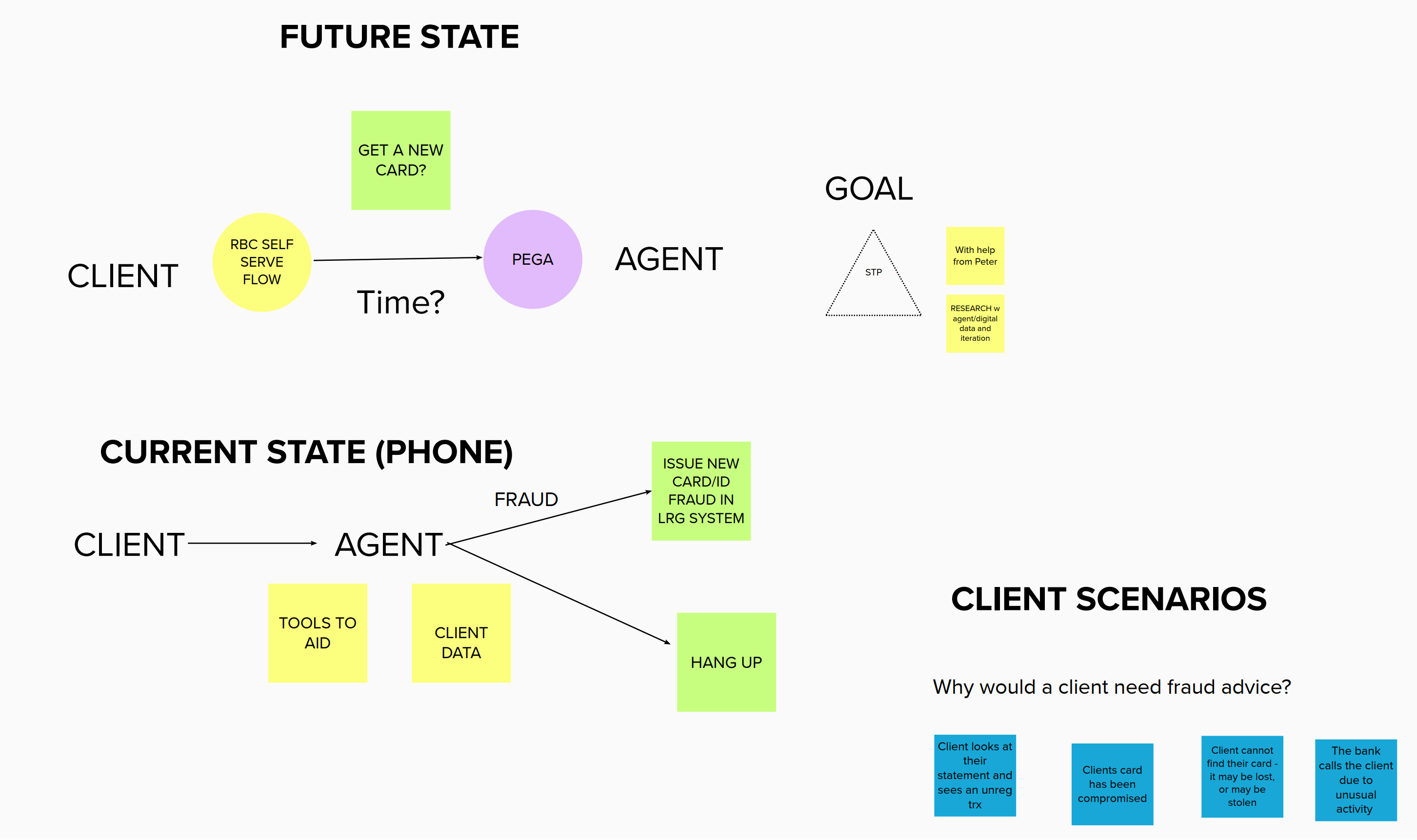
Current State Audit
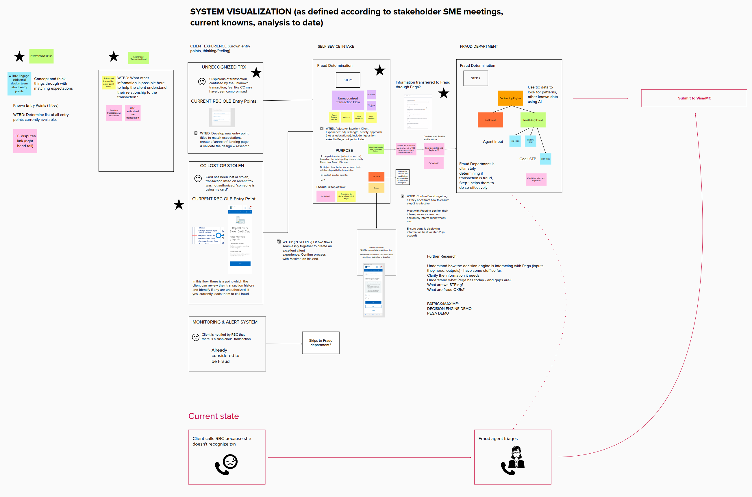
I created a system map to understand how the current flow works. The business director was my subject matter expert in this process and during many workshops, i sat him down, asked him questions and we put into words the processes an user would go through to submit a dispute case.
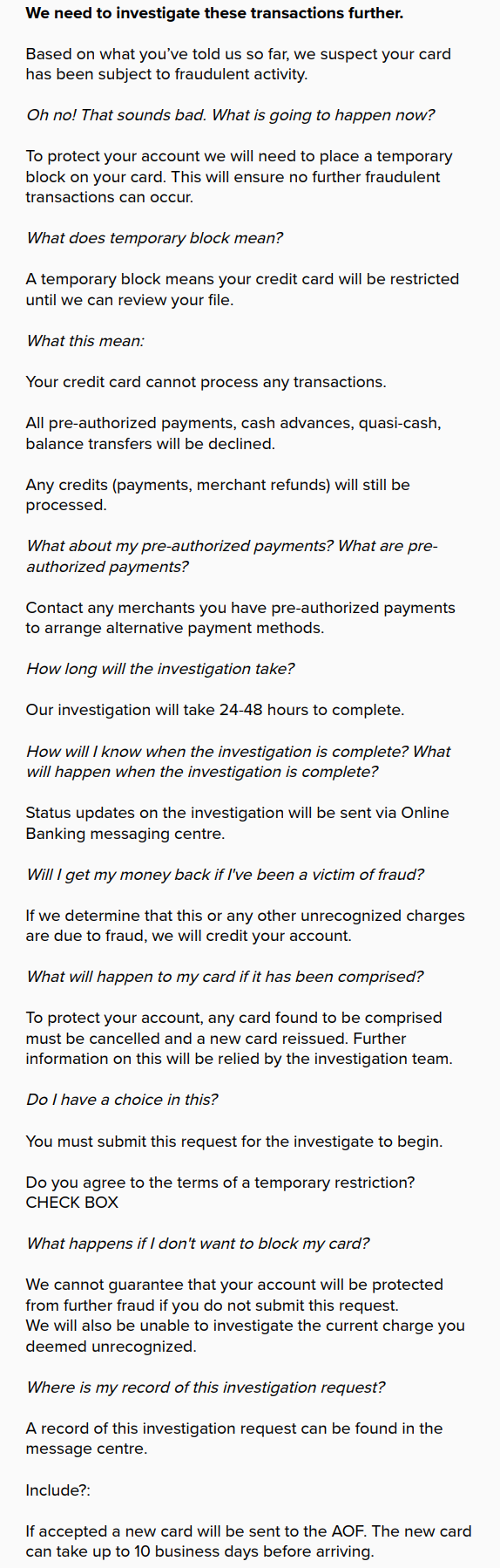
Then i worked with the stakeholder to write out a typical conversation flow that users would go through to help me understand users' mindsets and how the bank responds to the most typical user questions during calls.
Through more workshops, i created a more in depth features based system map to understand exactly what parts of our UI users are interacting with when they're going through the current flow.
User Research
I engaged the researcher and took him through my documents, findings to give him an understanding of current state and where we want to go. I then brainstormed with him potential questions we can ask our two user types: bank client and call center advisor. He workshopped with me to create user interview questions.
After getting my researcher's user and agent interview results as well as listening to agent calls together, we and the agents composed together in workshops to categorize the results into four stages of the flow.
My researcher created a proto-persona of a typical client that would call in.
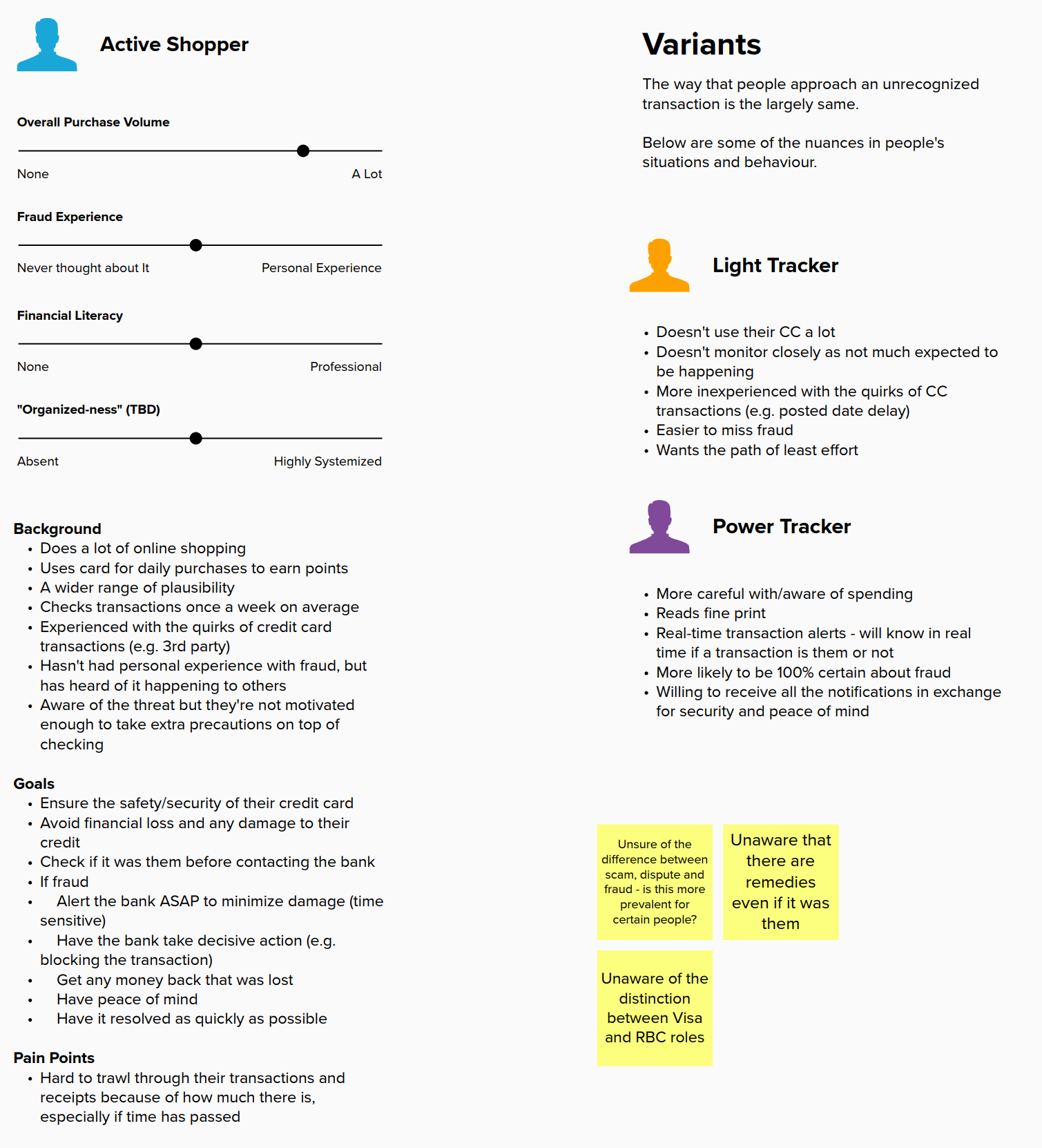
Usability Testing
The researcher conducted usability testing on our current disputes/fraud flow with bank clients to understand how our experience is.
The results from the usability testing were grouped into five common themes.
He compiled a summary of his research activities and general findings.
I summarized the research into a design goals map of how the system works and opportunities to explore.
The Problems
Major traditional banks have many teams that are working on the same product but using different standards in UI and UX due to team siloing. Leadership realized clients were complaining too much about the lack of ease of use, information recognition, outdated UI and lackluster user experience. They decided to push for a new standard across all banks, that will align all teams and reduce silos. Thus a new standard framework was designed to merge standards across together.
The Process
Setup
To test out a scalable process, i focused only on the Profile and Account Settings flow from our website. Once i have completed the process, i can take scale it to more processes with less setbacks. This project is to involve developers as well so i worked on this scalable process with a Full-stack developer director.
Problem: Lack of documentation
Our organization is huge, with many teams working on many different parts of the web experience in silos. We have a RIG Core Components team that creates only the components we use daily in our designs, but doesn't not dictate how to use them, when, where, why and what to use it with. These Core Components are taken by other teams and built upon to form new design frameworks per team needs. As you can see, now we have many different versions of components that stem from the same base. Unfortunately this Core Components team does not affect nor dictate how those other teams built their components, they only provide guidelines.
Problem: Sioled Frameworks
Teams in our organization are very siloed, they don't communicate with each other much. This means they have made their own design frameworks specific only to the components they use, which means they designed for only a subset of our whole web experience. The frameworks also lack key usage details like how, when and why to use them.
The Need For A Design System
- We have a lot of products but many of them look, use and feel different. The challenge is that lots of users won’t know product A and B are from the same company and will hate or love some products even though it’s all made by the same teams due to inconsistencies in past designs, code and no single standard/source of truth.
- here are a lot of legacy experiences that need to be improved upon in order to fit in with the market.
- Developers needed to reduce the amount of time they spent on components across all products. They also want one single source of truth and best practices for designs to easily understand how to create it.
A Design System Solves These Problems By
- Eliminating repetitive re-designing and re-development of UI across multiple products.
- Reusability of code across all products, in one area of use, with one single best practice and standards, thus reducing development time.
- Design inconsistencies problems eliminated across all products, only exceptions are custom designs for specific, one off use cases.
- Brand alignment for all products.
- Same standards of usability, effectiveness and efficiency for all products.
- Scalability of new designs across different screen sizes.
- Reduces siloing of design and different development teams by aligning everyone together on the same goal and standards.
Market Research
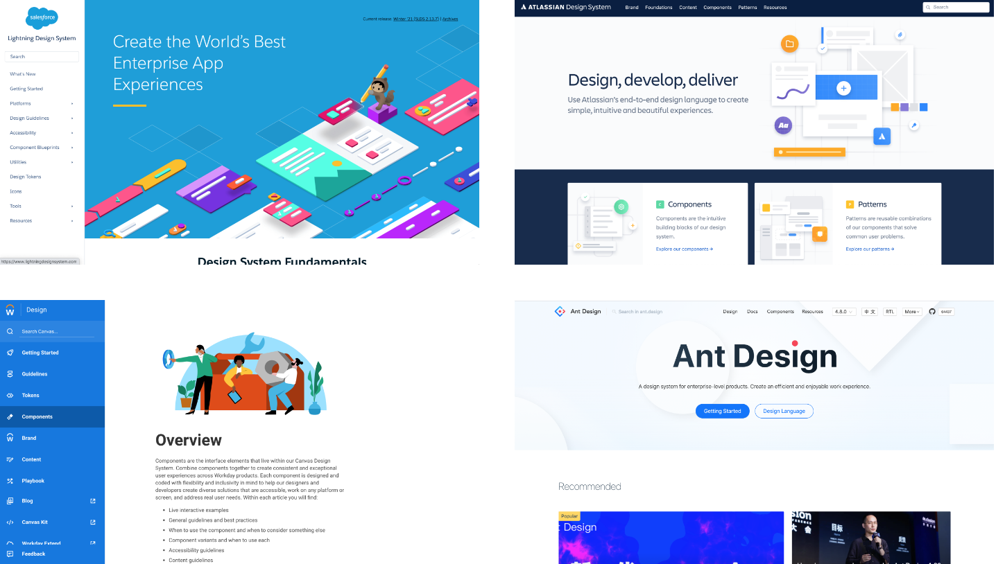
There was an audit completed already with priorities on what the create for our design system when i joined this company. So i continued with that list. I looked externally to the market. What were other Enterprise companies doing with their design systems that i can learn from? I looked at Workday, Atlassian, Lightning, Ant.Design, Polaris, Mercury and Carbon.From this market research and what our current product needs are for upcoming release, i started creating new components and patterns directly on my project work and contributed them into our design system to create new components and patterns. I utilized weekly meetings with the rest of the team to sit down, discuss, ideate and finalize my ideas to ensure we all agree on having them in our design system. Then i proceeded to add them into our system with specifications labelling on them to ensure developers cannot get margins, paddings wrong as well as documentation the interaction details so everyone understands how it works.
Structure
The design system is split into four parts: Foundations, Components, Patterns, Data Visualizations.
Foundations are the building blocks of UI, they include areas such as typography, colours, grid system, icons, spacing, shadow depths.
Components are building blocks that make up UI.
Patterns are entire pages, templates or large features composed of smaller components.
Data Visualizations are just that, graphs used to show and explain data.
Business Needs
For decades, on a daily basis, portfolio managers had to use legacy software that is not very usable, user friendly or appealing to use. This new portfolio management software that i designed is a first of its kind in the market that will hopefully set new standards for client expectations and user satisfaction. This software improves the day to day job of portfolio managers by:
- Improving information architecture to ensure processes and features are connected in highly useful and usable manners.
- Creating software features and processes based on user research of needs, pain points and market insights instead of what product managers think users want.
- Clarification and removal of all unimportant information and features to ensure software is as simple as it can be.
- Modernize UI to be easy to use, engaging, solves user needs and is visually appealing for daily basis.
- Utilizing automation to reduce manual effort on repetitive tasks.
- Allow for permissioning of different user types in the future; different users will have access and visibility to different software features and processes.
User Research
Methods:
- Product managers, directors, end users interviews on how they work, when they work the most, where do they usually work, who works with them, why they prioritize certain tasks over others, what their frustrations, pain points are and what they wish can be easier or better.
- Competitive analysis of competitor and similar software like Excel, Google Sheets, Microsoft PowerApp, Asana, Airtable.
Results:
- 6/9 say current software is slow and wish there was a faster, more efficient and less tedious way to complete daily tasks.
- 100% of SMEs and users say they only do their work on a laptop or desktop.
- 100% of SMEs and users say portfolio management tasks are usually a priority over their other work tasks.
- 100% tested say that having to go to multiple different pages to access action items pertaining to one item on one page is really annoying and illogical.
- 80% said they wish the “look and feel” was more modern like other apps they use daily: Ex: Google, Word, Excel, Powerpoint, Salesforce.
Insights:
- Rebalance portfolios without error.
- Edit accounts easily without many clicks.
- Be assured when accounts or assets are affected due to interaction with UI.
- Have only functions they use on a daily basis appear on UI, disregard all other.
- Have smart UI/automation features to reduce manual input.
Persona
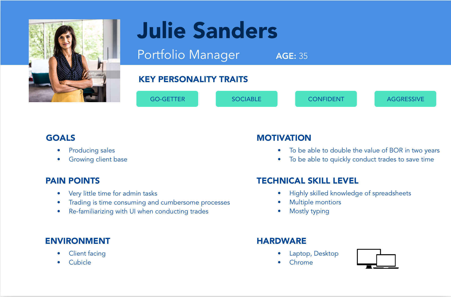
User Scenario
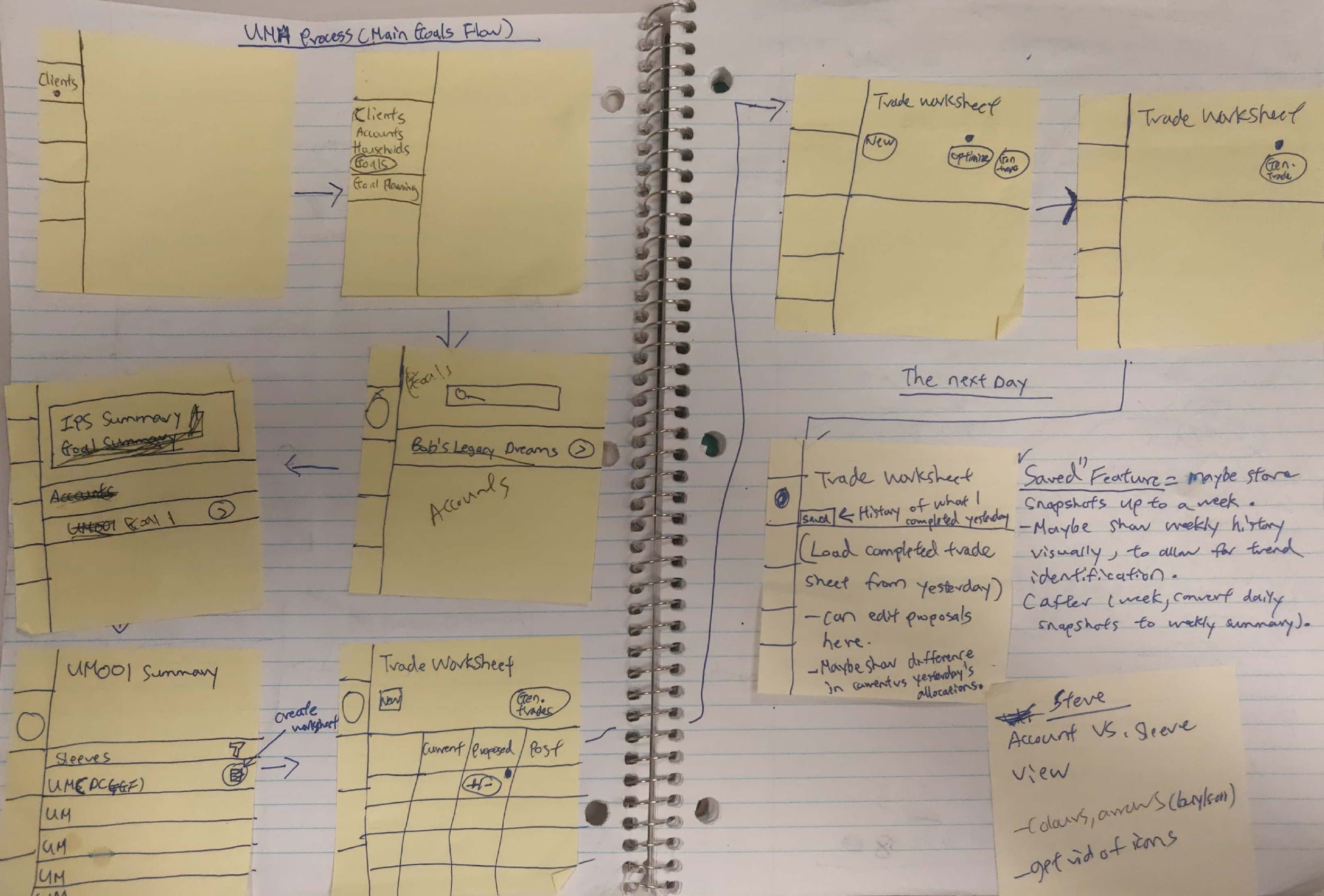
Julie has been a portfolio manager for over 8 years now. A major part of her daily life is to conduct trades that cater to client requirements. She uses an outdated software at her office to view proposals and conduct trades daily. She wishes the trading process was easier and less time consuming so that she can focus on her other work responsibilities.
Discovery
The Product Managers started by providing walkthroughs of the current product, its features and some user pain points.
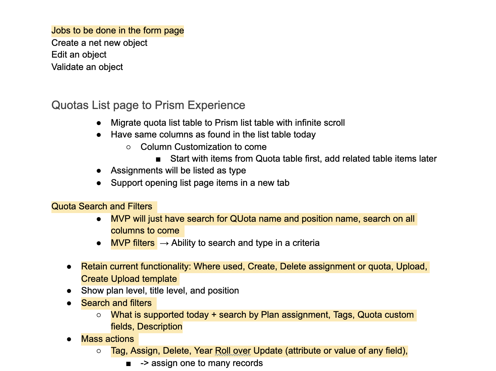
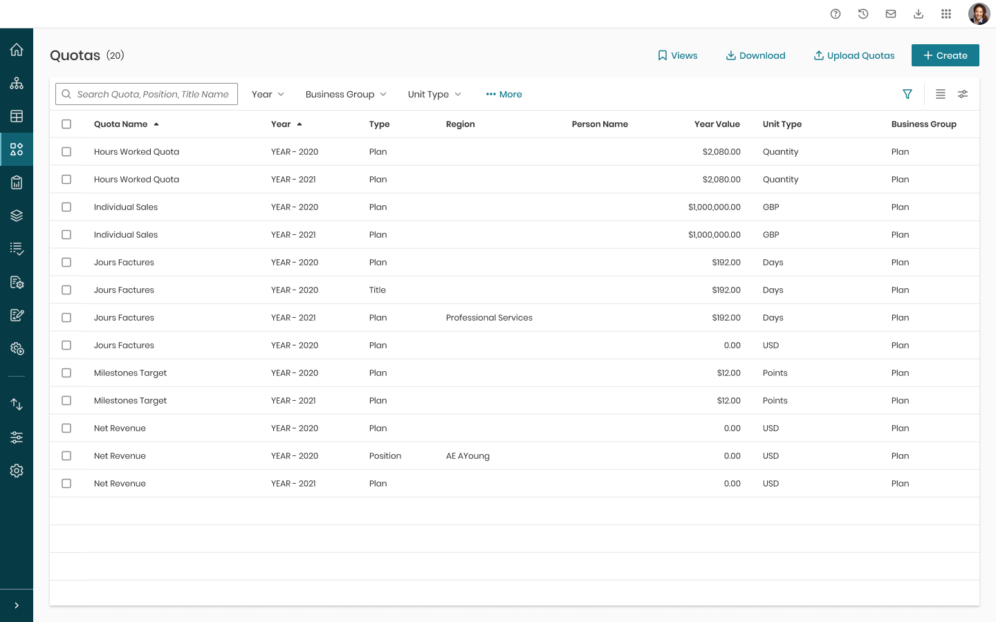
The First Page is our “search page”, where users search through the list table accessed by clicking on All Assignments. All Assignments or what we call List Page, shows all our Quotas and its respective types of Plan, Position and Title. The action buttons prompt modals to appear with their respective functions. Once a Quota is clicked on, it goes into each individual Quota’'s view on what we call the Forms Page.
The Forms Page is divided into three sections, the top part are the details of the Quota we are using, the second part with the list table are version of the page itself that the user creates on a yearly timeline to set different quantities of data in the data table below.
The last part is the Assignment Details, Assignment meaning either a Plan, Position or Title level assignment to the Quota. Quota must have a Plan Assignment when created, if users want to specify more specifically, they can specify deeper into Titles or Positions. A Plan is a large, high level plan that is just a number, Titles are job titles that the plan can be divided into, ex: Administrator, Salesperson, etc… A Position are regions or job groups, ex: Canada, USA, Sales Team.
I created business stories that encompass feature requirements at a high level and went over it with the PMs to confirm which ones we want for MVP.
User Stories
I created business stories that encompass feature requirements at a high level and went over it with the PMs to confirm which ones we want for MVP.
.png)
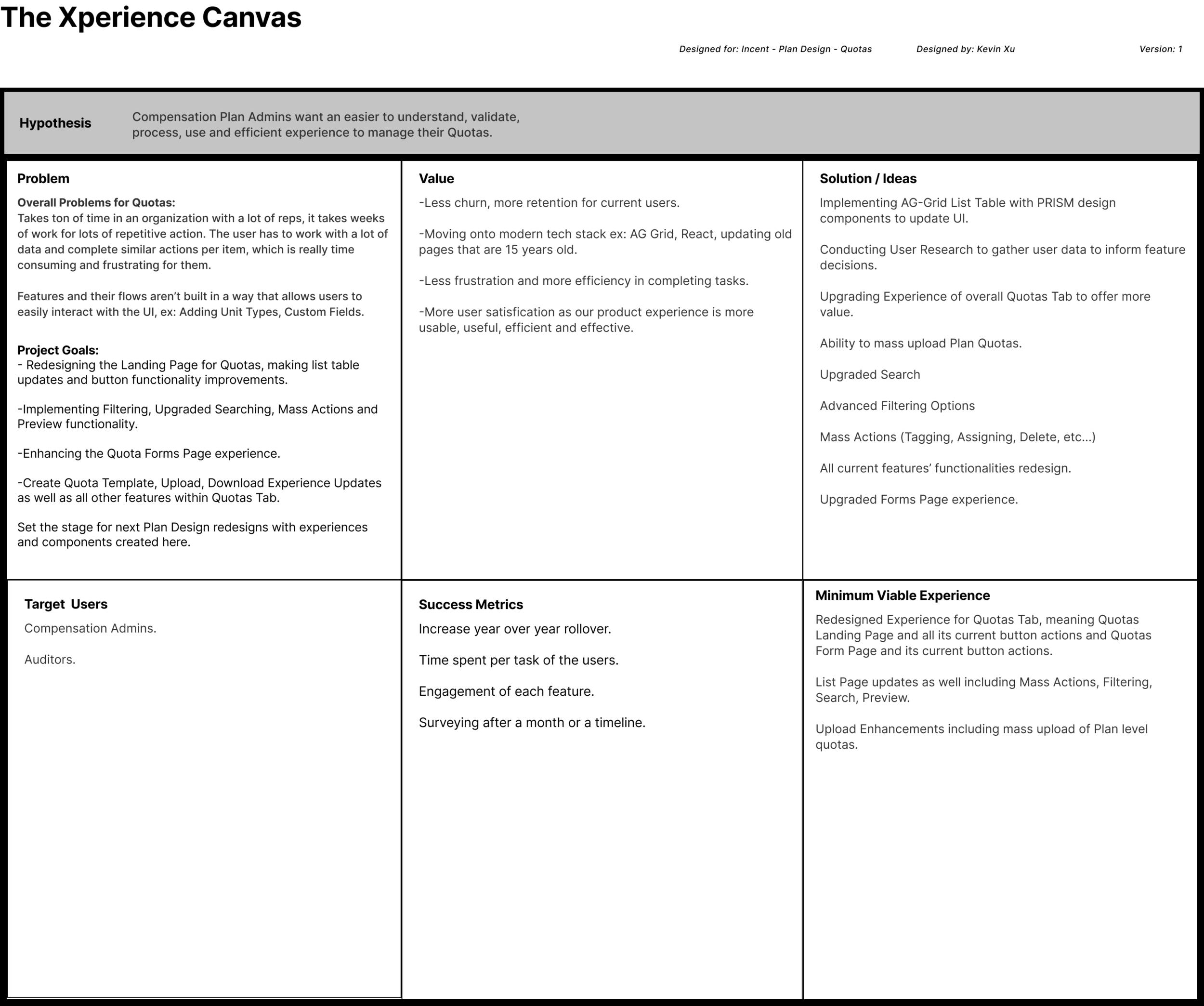
The Experience Canvas
I created a document called the Experience Canvas to summarize the Scope of our Project.
User Research
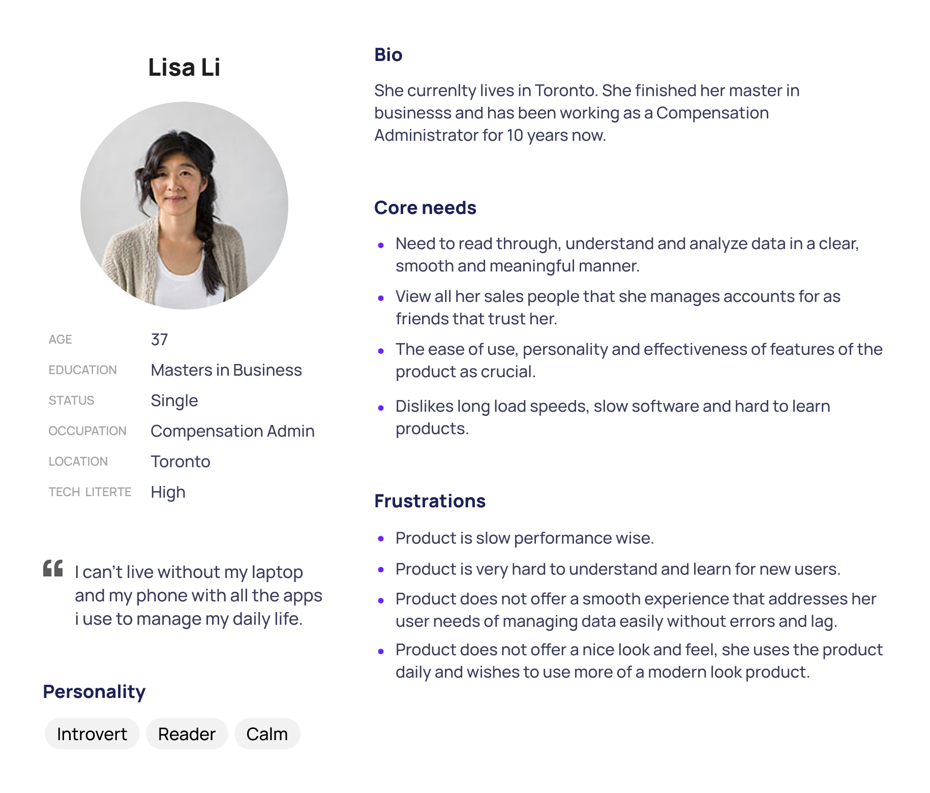
I read and understood the existing user data we have gathered over the years from past PM discussion with team managers and end users, as well as their understanding of the product and the market competition and trends. I also interviewed three end users during to understand their day to day, pain points and desires. Once this was done, i compiled a Persona to represent the main user of this product: Compensation Administrator.
Persona
Current Information Architecture
Once i understood enough about the user i am designing for, i created an Information Architecture Map of our current Quotas Product and planned out with PMs what will be part of MVP.
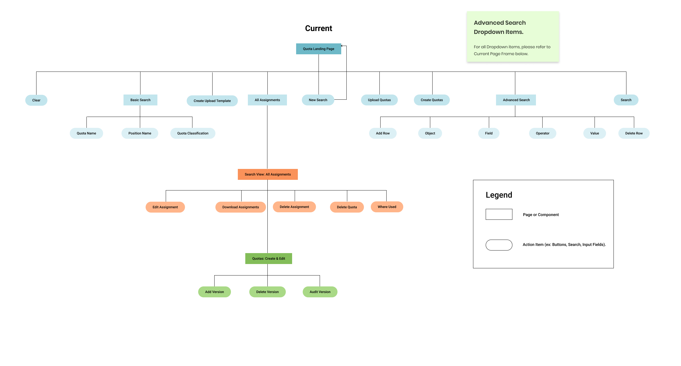
New IA
Component Design to Framework
Since i had created a design system with the rest of our team, our typography, colours, grid layouts and many components and patterns have already been defined. Thus i only looked into the market to see what kind of styles, features and ideas i can utilize to address my user’s problems and design solutions. We did not have a standard for our Forms Component so i researched upon that as well and created a standard.
Ideation
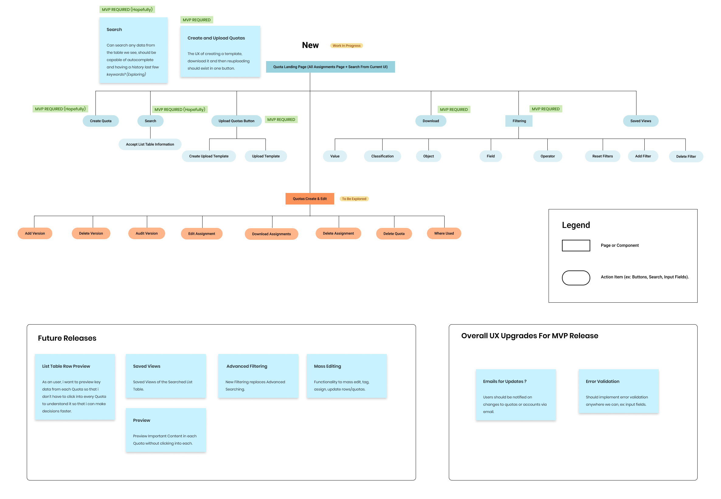
From here, i roughly sketched out on paper and pencil how my user flows per feature will work, then converted them into mockups. Below are the first iteration of some ideas.
- List Page with Search and Basic Filtering (toolbar on list table header).
- Advanced filter idea that activates from the filter icon on top right of table.
- Another Idea of the Forms Page.
- Idea of Versioning on Forms Page that is draggable across the screen.
- Form Page with Versioning Feature Clicked on.
User Testing
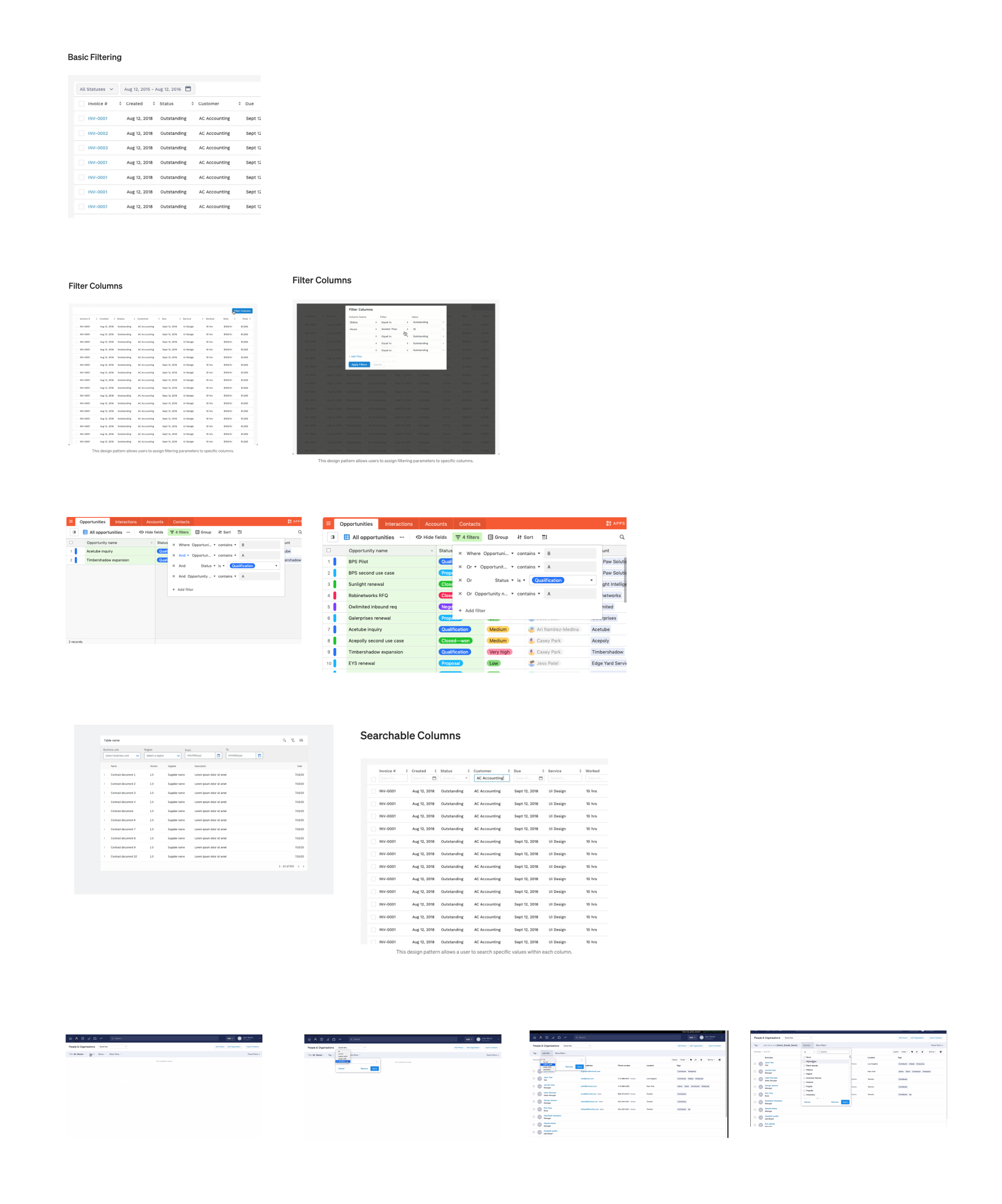
One feature where i didn’t know what design to go with, i decided to conduct user interviews on using a software called Userlytics, to see which design makes the most sense for our users in terms of their preferences, pros and cons. I focused on three design patterns, first being the filter toolbar on the top of the list page, second being in column filters and third build a query builder.
Research Data
Below are the results of the research that six Compensation Administrators that agreed to participate in as well as data from our internal testees, the Product Managers. I valued external stakeholders more as insights into user behaviour since they are our end users and offer primary sources of information.
The Result From Research
From here, i decided to go with the Filter Builder as our go to filtering pattern. However when scoping with engineers, they said they will be unable to deliver that this year so we decided to first have our toolbar in the first MVP release. Having the toolbar also allows a quicker filtering experience that some users will prefer, instead of building specific queries to filter down data. The Search bar location was moved from the right to left inside the table on its header row as part of our team decision on our design system patterns since it encouraged users to search first through all the data, then dive specifically into data groups, then build out queries using the Filter icon on the top right side of the table aka our Advanced Filter.
The Search Bar in design, has ability to search on all available column headers as well as non-frontend reflecting categories. It also has autocomplete and recent search history (up to 10 items) functionalities. However, during scoping with Engineering, they will be unable to deliver the full Search Bar design for our first MVP so we discussed which categories we can deliver that will not impact performance, this results in our Search bar only being able to search Quota, Position and Title names for now. The differences of the functions in Search, Toolbar and Advanced (Filter icon on the right) is that Search is an open field where the user deducts and tries to find something from a very high level, toolbar items are categorized data groups (Ex: years, unit types, regions) that are not custom queries like names or numbers. Advanced builder creates equations to specify filters into very minute details. The decision from me was to offer all three features since we should accommodate for all user preferences in our UI, not limit them to what they want to do as long as our features makes sense from an experience perspective.
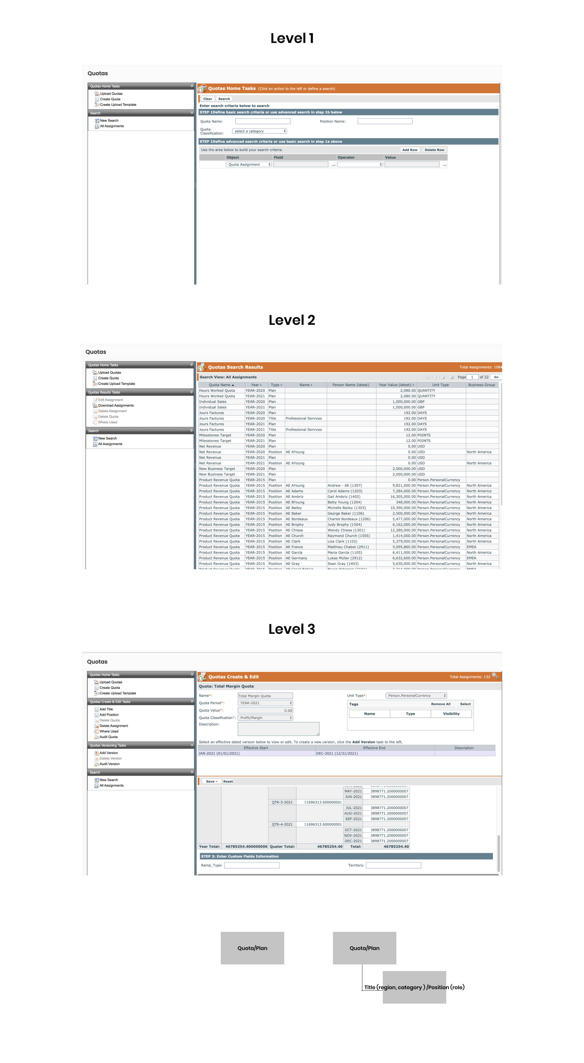
Hi-Fidelity
During the design finalization phase, i conducted user interviews with our panel of users on a weekly basis, asking them on their feedback on the designs and their preferences and reasons why something was useful to them or not. After multiple more discussions, guerilla testing due to limited time constraints of deadlines and scoping with engineering team, the final prototype was created. Here are some screens from it, final prototype i can show on request via email during a meeting.
Preview Feature Flow
Users will have ability to look into each row item, see all the content and edit the editable fields. This reduces user pain point of having to jump in, scroll and jump out of each page they want to look at since they usually scroll through hundreds of pages a week.
Forms Page
The Forms Page was redesigned completely. The buttons on the left have moved to the top of the page, with sticky header functionality so user can access them all times when scrolling vertically. The Quota Details card can be minimized to save space since it is repeated information across all types of assignments (Plan, Title, Position). The Assignment card houses versions, details of the assignment and custom fields of it.
Versioning
Ability to add multiple versions in a timeline from most recent to oldest of the year; the timeline always starts from first day of first January to last day of December of the year.
Unit Type
Ability to add unit types on the go now instead of current experience in which user goes to the Settings tab to create, add and delete then come back to the Forms Page to continue their work, its a very disconnected experience.
What I Did After Prototyping
- Collaborated and oversaw development of designs with development team.
- Met with PMs to setup metrics on Pendo for features and flows quantitative tracking.
- When design was released, existing users who signed up to try the new redesign were interviewed to get their qualitiative feedback.
- Iterated upon the feedback from interviews and Pendo metrics.
Features Prioritization
During the workshop, i ideated on potential features that will exist in the new design of the first journey: On-boarding. Then i created a 2x2 Kano Matrix of most valuable to least on X axis and most business value to least on Y axis. I discussed with the business team and we decided to focus our MVP around the following features.
User Flows
Current Onboarding Flow
New Onboarding Flow
Low Fi Sketches
After understanding how the user can move through on-boarding, i began to sketch out rough wireframes to visualize how the interaction design might work and what the user flows might be.
Mid-Fi
I used Sketch to design the mid-fidelity experience.
Hi-Fi
I conducted user interviews on UserTesting.com with the designs to get user feedback. The feedback was overwhelmingly positive as most people never seen or used a banking experience like this before in North America. They were satisfied with this quick, easy and smooth onboarding flow and accounts creation. I continued on to create the hi-fidelity prototype in dark mode while incorporating the feedback.
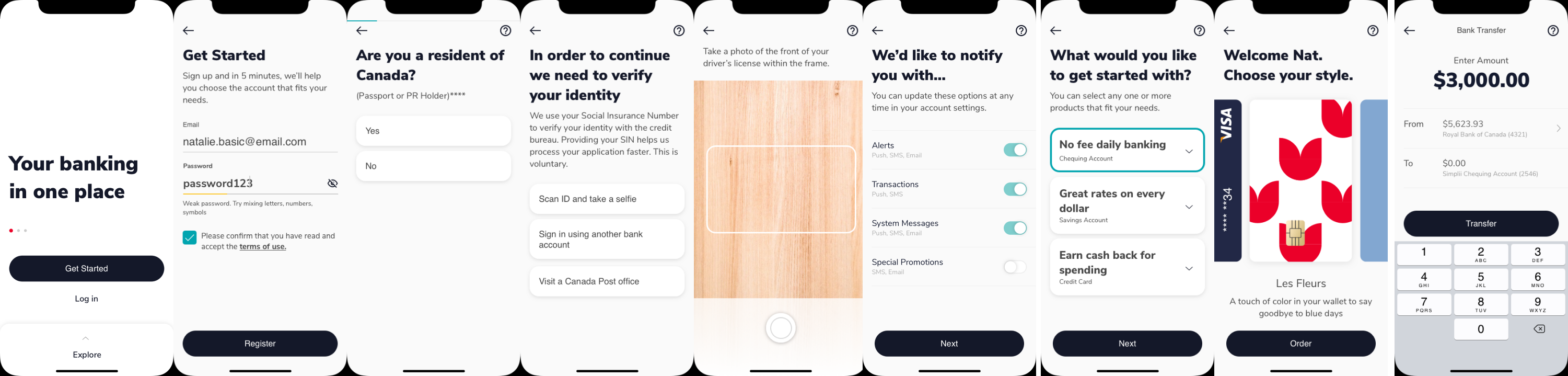
Dark Mode: Full Flow
A popular pattern in mobile app design at this time was dark mode, so i was asked to create a Dark Mode.
Other Journeys
After the onboarding flow was completed, i designed some other screens the business required.
Project Handoff
Once i completed all my journeys, i presented them to the Business Directors to get their feedback. Then I finalized the designs using everyone’s feedback and handed it off to developers for implementation scoping, communicating with them to address all design related questions in person, via email and Slack. "
With involvement in the project complete, the MVP prototype was handed off to IBM Consultants to scope out what it would take architecturally to code and build the application.
User Stories
As a portfolio manager, i want to be able to rebalance and manage my clients’ portfolios without any uncertainty so that i can ensure no mistakes occur.
As a portfolio manager, i want to be able to clearly read, understand and process information on the screen so that i can make calculations needed to rebalance assets in a time efficient manner.
As a portfolio manager, I want to be able to access all action items i need to get the job done so that i can save time by not having to search through software UI for buttons and links i need. Or maybe, the software itself can automate certain processes for me.
User Flow
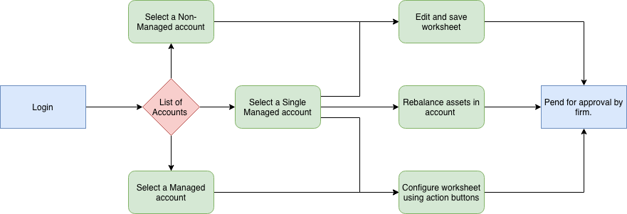
Information Architecture
%2B(1).png)
Scope Definition
I sat down with the PMs and Directors and planned out which features we want to incorporate into our redesign.
- Build and integrate algorithm’s function into UI buttons and processes for rebalancing portfolios.
- Allow for simple, spreadsheet like editing of asset data.
- Provide user feedback and indication whenever an action has been processed or whenever there is an error, change or edit, no matter how minor.
- Analyze, restructure and redesign information architecture of software.
- Allow users to save PDF versions of content and access locally supported file drives.
Low Fi Sketching
I sketched out low-fidelity wireframes for all user flows, met with product teams to ensure UI is aligned with business user stories, converted them into mid-fidelity, discussed and received feedback from business and development teams. I then converted them into a hi-fidelity Invision prototype for feedback and usability testing.
Prototype and Usability Testing
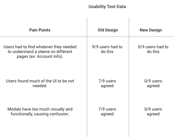
I used Sketch to create a hi-fi prototype and conducted usability tests with 9 individuals, two are product directors of the product, six are unrelated to the product employees within the company and one end user. Insights from the usability tests led me to iterate on my designs. Below are some pain points of the old design and how i solved them.
Many Unused Features
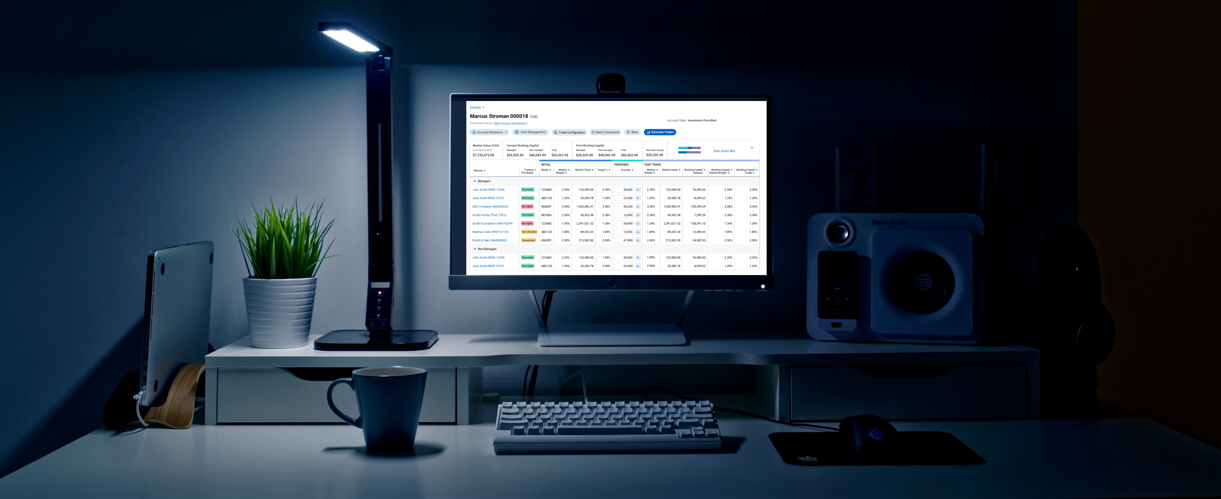
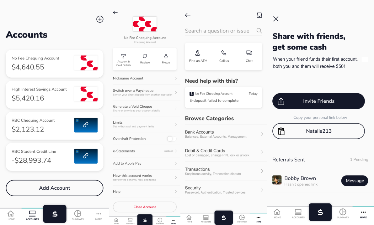
In old design, users had to go to each account and “Generate Trades” at each account. They had to individually edit and change every asset row within the account and then release at each account. This was tedious and repetitive work, many users just want a quick and accurate way to edit assets in accounts at the top level; this lead to the creation of buttons at the “Account List” level. Paired with backend algorithms that automatically adjust and rebalance assets in every account, users now do not have to manually rebalance if they do not wish to.
Users just wanted to look at their Managed and Non-Managed accounts, nothing else.
The five search bars were gotten rid of because users did not search for an account unless truly clueless about an account’s information. Even then, most use “Ctrl-F” to search for letters or numbers associated with that account, they do not remember specific information about the account as required in the old UI.
Lacking Desired Features
Originally, many processes were not linked correctly. For example, if the user clicks “Rebalance”, a modal appears and asks the user to input specific ID numbers, codes and item names not shown on this screen. The user would have to remember all of this information before clicking the button. Often times, they forget or they write it down on paper or in their phones before they come back to the button.
I Incorporated all necessary buttons onto one screen, removed useless buttons and redesigned UI for ease of information processing, allowing users to get the job done in less time and less frustration.
Components Cleanup
Many components from old designs were not used or needed anymore, thus I eliminated useless aspects from all components. Ex: Modal. I also redesigned all components in modern UI and UX.
Usability Testing
I tested the prototype with the same group of people i interviewed at the beginning of the project, here is the results:
Next Steps
I worked with the full-stack developers to ensure design consistency during development as they pushed to UAT and then launched to PROD.
Implementation
The design system exists in primarily Figma for developers to reference and Sketch as a backup file. We then uploaded the system into this third party website built for design systems, called Storybook. Developers are easily able to access the website from anywhere, even if they never touched Figma before. This is where their one to one translation lives. Weekly meetings are set to align with the development teams that is implementing our design system to ensure any limitations they have is accommodated for either in changing our design standards or creating custom aspects of the component to cater to specific limitations.
Designers in Canada, USA and India have begun to utilize the design system to create new designs or when redesigning products. Developers can easily access the pixel perfect designs’ code using Storybook and view designs that have not been implemented yet in Figma.
The Organizational Need
CGI is huge, international consulting company with many products worldwide. Until now there is no common acceptance or documentation on what our UI and UX patterns and standards are. Many products look and feel different to the same clients across the company, this is a huge problem. I was tasked to create a design system from scratch by my business director since i was the first UI/UX in my design team at the time.
- Eliminates repetitive redesigning of UI elements, now designers utilize system components and apply different themes, customizations and layers to it.
- Designers can easily create high-fidelity mockups for business and product teams to use for marketing, sales and product related requests.
- Developers do not need to worry about re-coding components, since they can reuse the same components and customize it to their needs.
- Product development time decreases since designers and developers can ideate, design and iterate faster.
- Inconsistencies within UI design are eliminated due to an universal standard across all products.
- Design updates later in the software development process are less frustrating, since designers don’t have to re-design anything and developers don’t need to build from scratch.
Products Audit
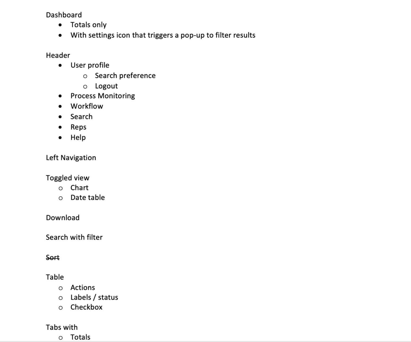
To begin, i conducted an audit of all components, patterns and features our products currently use. To clarify definitions, Components are individual UI items such as cards, chips, badges, Patterns are flows of many or one components put together like a Settings page, features are larger combinations of both like the feature of being able to create and edit Data Tables on a Dashboard. This list was split and categorized into Components such as navigation menus, data and list tables, buttons and Patterns such as different alerts offering different actions based on context of user interactions. Ex: on delete i have an undo button but on Saving i have either a View Saved button or none depending on how large/crucial the effects of the save action was on.The schedule for the first release of the design system was prioritized on how many products shared the same components and patterns and which ones i will need to use in my designs for the closest upcoming product releases.
Market Research
After completing my audit, i looked externally to the market. What were other companies doing with their design systems that i can learn from? I looked at Shopify’s Polaris, Google’s Material Design, IBM’s Carbon Made, Ant Design, Apple, Lightning, Morningstar design systems. I ensured what i created is aligned with the market standards.
The Framework
I organized the design system into parts: Structure, Styles, Components, Patterns and Assets.
Structure
Styles
Components
Patterns
Implementation
I worked with the development team to get this implemented. They created their code translations of this system in their own repositories. I tested the efficiency of the system with them in an experiment, i asked them to build a homepage of whatever they want in anytime they want. The developers finished building a homepage within 30 minutes. This was a great reduction in the time it took to code a new homepage from scratch, without the design system, it usually takes a week.
As UI developers utilize Angular 6 to construct their translation of the design system, i worked with them to ensure design is followed as closely as possible, considering Angular 6 limitations and iterate on my designs as needed. The developers added their own code best practices to their system, in which all developers must follow. Developers can then copy and paste the code from their library directly into their code editors and apply it to any product they are working on. If they wish to create components that does not exist in the design system, they consult with the design team first in a requirement meeting. This ensures one single source of truth from both design and development.
This framework is now used in UK, USA, Canada, India and France.
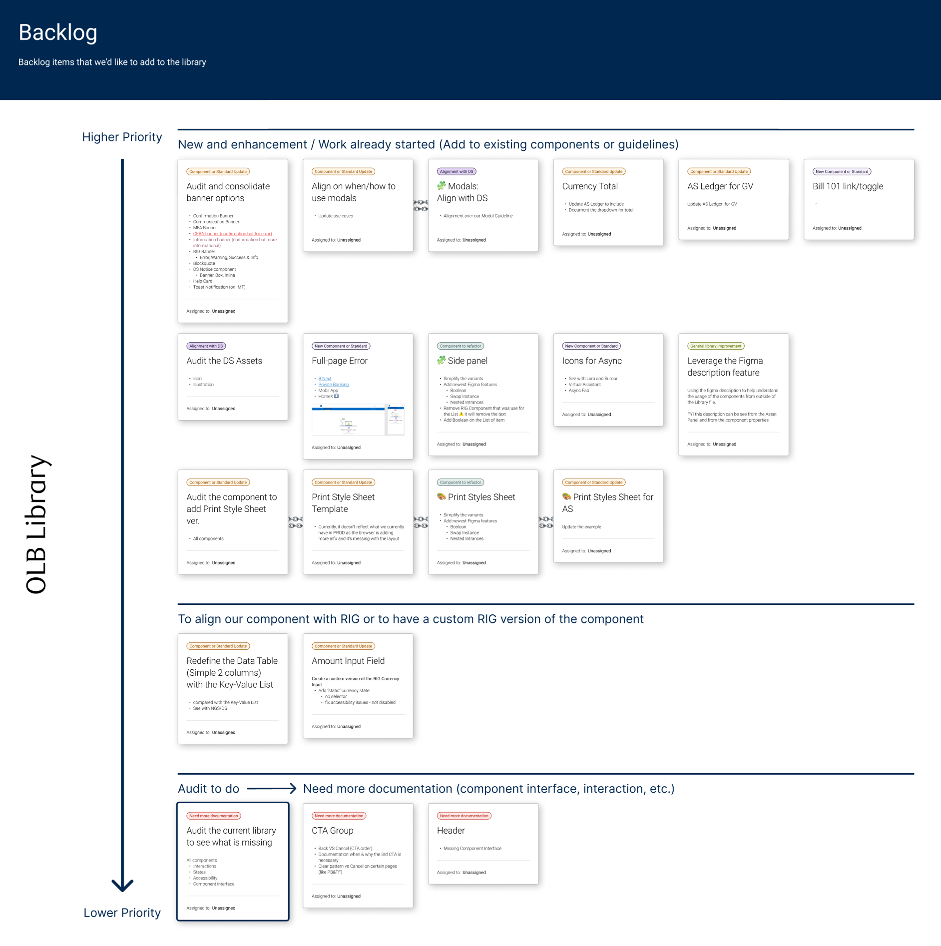
Flows Audit
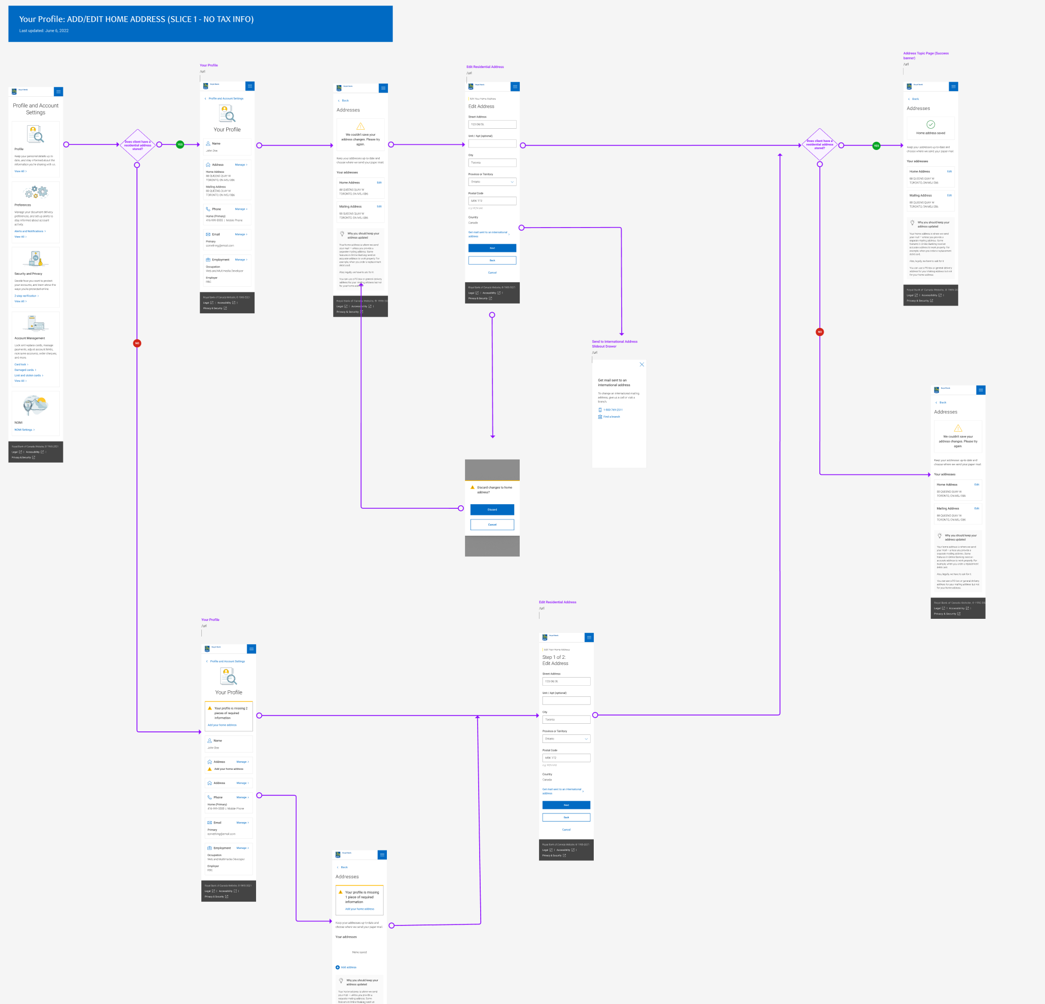
I started to create the new design framework document based on the Profile and Account Settings flow to note down what components we have as a way to start small and learn along the way on how to scale this new system i'm creating. As you can see below, its a long flow consisted mostly of input fields, validation, error states and cards.
I noted down common components used like the Input fields, cards with icons, banners notices. From this i understood what components we have, which formed the basis of the new library i will make from, the NGS library. As seen below, this is how i discovered common groups of components used among the flows. I then sat down with frontend developers to see what exists in their shared code library and what doesn't. What is custom built will be added to their shared library, which is their own form of a developer framework.
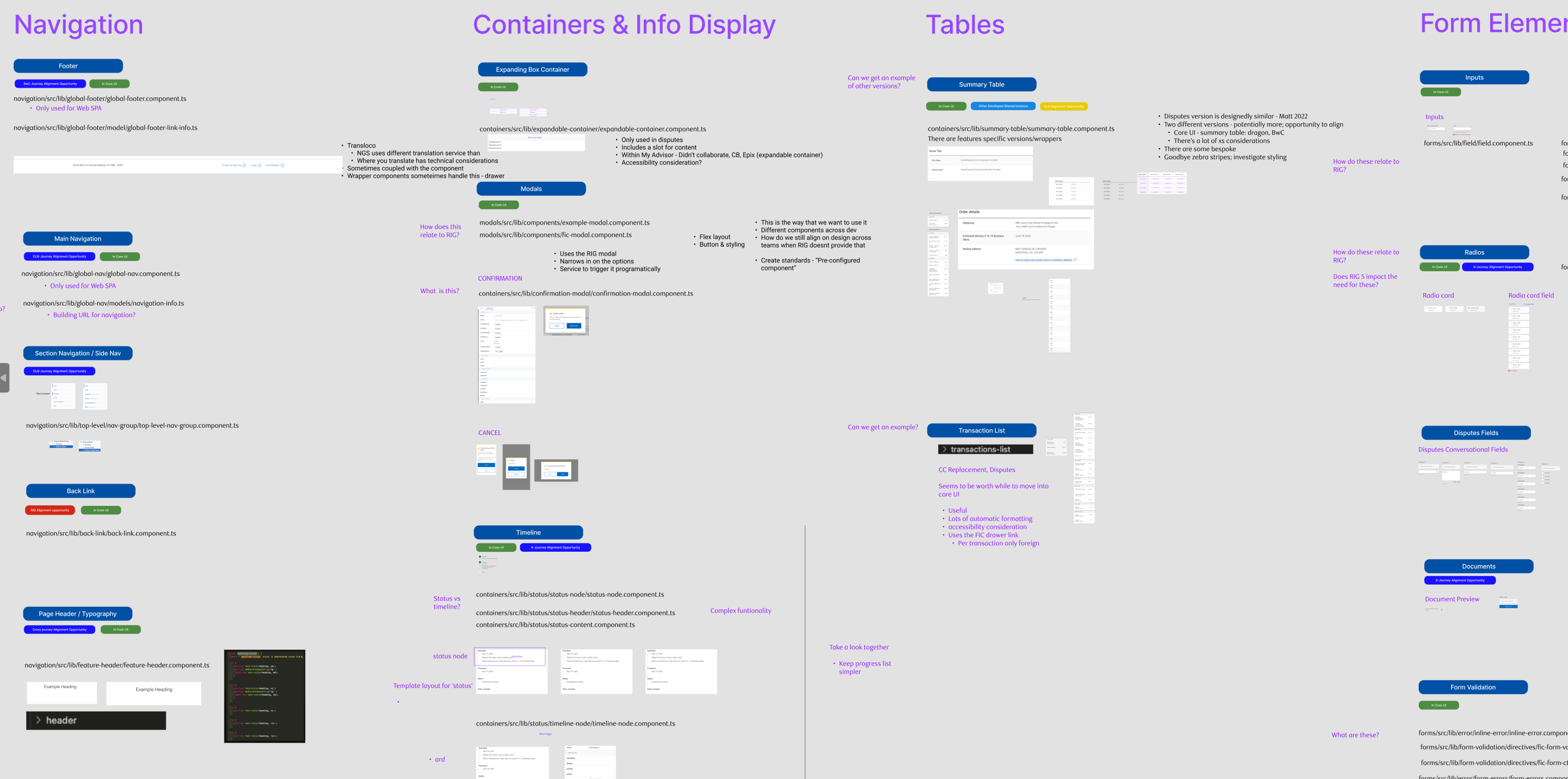
Structure
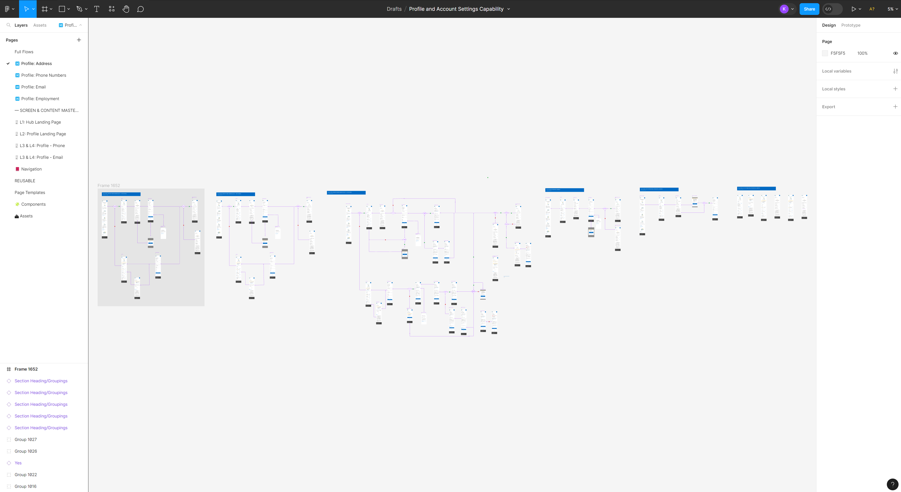
I structured my design system into three organizational page levels, Full Flows, Screens/Content Masters and Reusable Elements. Full flows are just current flows we have in Production. This library will be built from the Profile and Account Settings flows as a starting point for this new process in the organization.
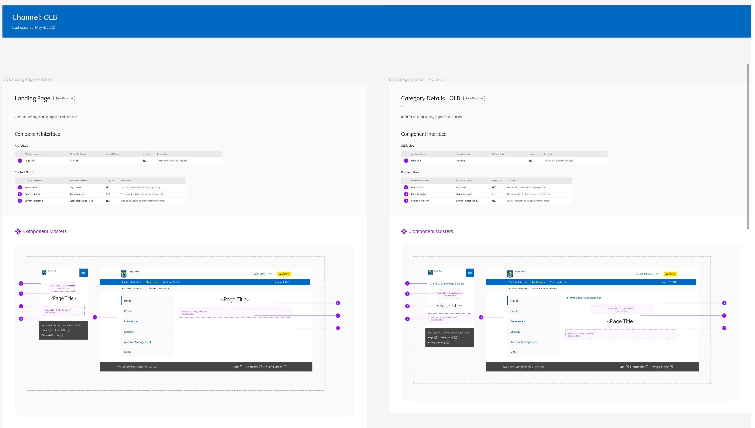
Screen and Content Masters
This section contains pages translated into component masters. I put example pages of where i got components from, with the component masters in its own frame on the right. This is to help designers understand where the components are used.
Reusable Elements: Templates
Templates are page level patterns that is reusable, i created them as well to make it quick and easy for designers to create pages in a flow. Since most pages are similar in terms of features, the designer can just edit these template directly and add their custom components as needed while the similar parts all stay the same. This makes it fast and easy for designers to create new pages.
Reusable Elements: Components
I took the OLB Library's way of documenting components and reused it for the NGS library. The main showcases of this document is that it shows examples at different breakpoints of the component, then into what is customizable or not. Specific details on how the component is used is called out. Built In Interactions are called out and defined. The master component itself is presented for anyone to copy and paste as Instances. There's accessibility notes on things like tabbing order. At the end there's a checklist for the designers using the component to understand the state of the component.
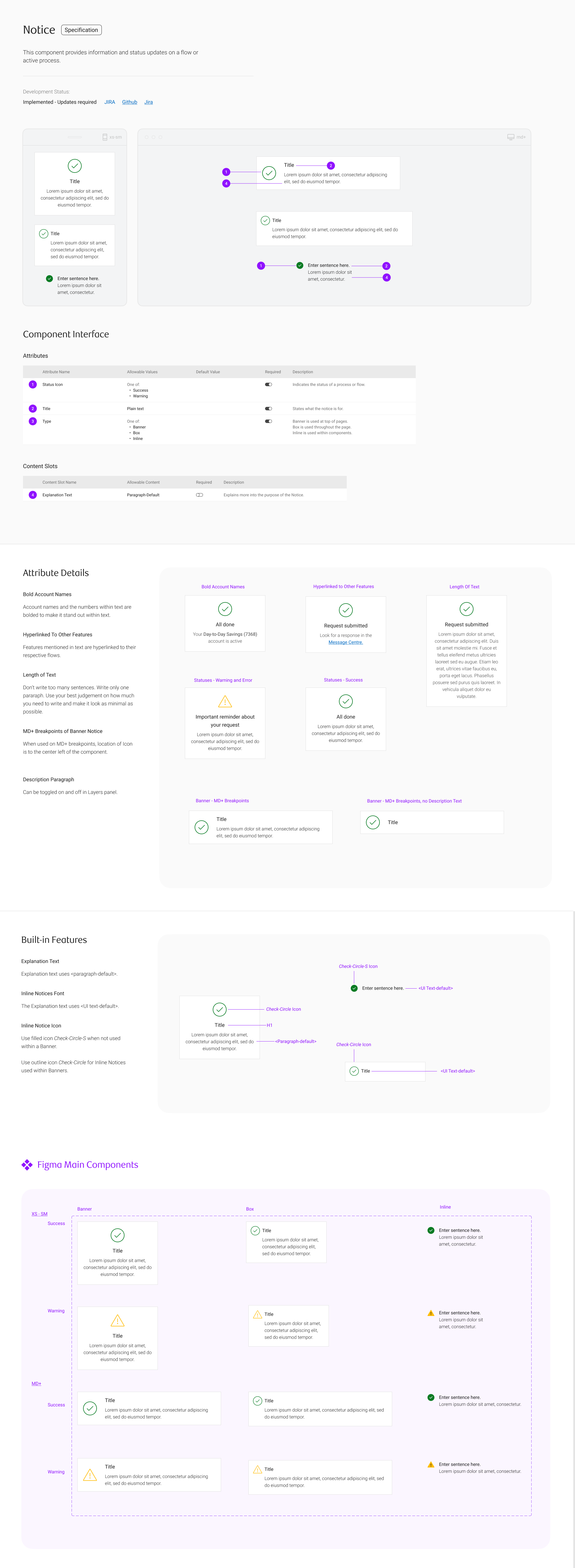
Each component also has variants, different components that branch from it. I designed this so designers can simply swap between the different types using the variants selector, as well as aspects like their viewport size, icons used and explanation test on/off.
Merger with OLB Library Team
After i finished this document, i reviewed it with my design director and development director. They loved the new structure and process of the framework and decided to give me the greenlight to proceed onto a larger scope, working with the OLB Library design team to see how we can merge together into one larger library that will be the standard across our two teams. Me and another new designer who joined me at this stage, as well as two designers on the OLB team planned out a to do list of components to merge based on complexity of component itself and how big of an impact it will have on the website. We set weekly work sessions to get together, brainstorm, jam and make decisions on how we want to align.
I copied and pasted all my NGS components beside their respective OLB components in the OLB library Figma file. This helps to see differences in our same or similar components. My NGS components are titled in yellow backgrounds and lablled DS Alignment Needed. Within the OLB Library, not even component is documented in the same way. Hence that is something we are doing as well, to reuse the same format of documentation(seen on the right side in image below) in every component.
Scaling The Process
All components will be merged into one library and then, this will scale out to other teams libraries and merge them together as one as well. Spreading this process out to all teams until there is only one library. This process heavily involves collaboration, communication and decision debates to come to a single conclusion. Sometimes user research is involved to help make data based decisions. Sometimes market research is involved to justify decisions. What's great about this process is that it democratizes the design library, everyone will eventually use it and everyone has a say in it. Representatives aka decision makers relay progress and decisions to rest of the team so everyone is aware and can voice their opinions on the components. Meanwhile developers are communicating across silos and figuring out how to align code as well as we align desgins. It is a long and time consuming proces but It is bringing teams together as we all decided on one pattern together. For niche cases where we need specific versions of components, that is also accounted for as long as there is justification for it.
MVP Planning
I created a MVP diagram of the new flow's experience.
Ideation
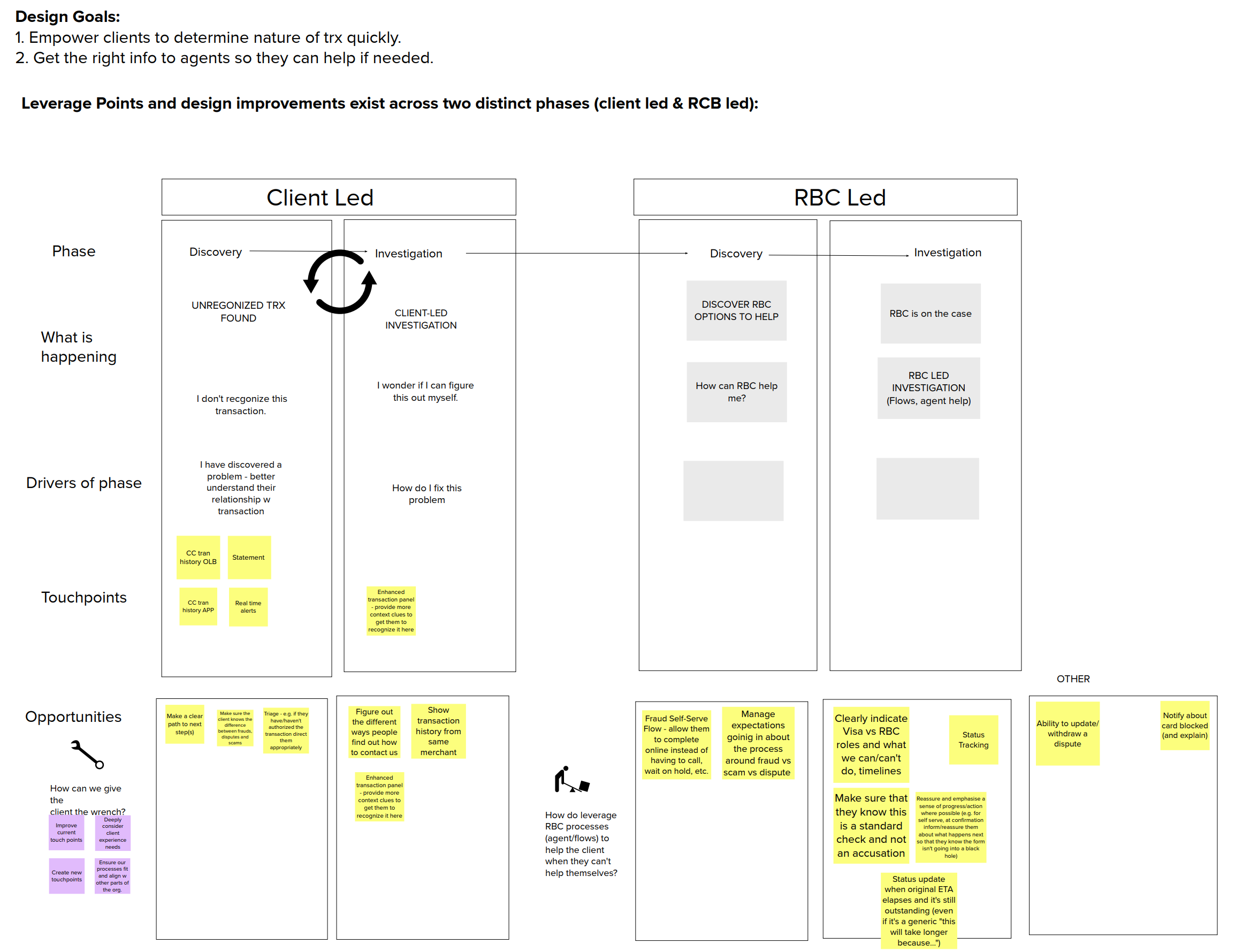
The redesign is focused on two parts, the investigation of transactions on their own from a client and the self-serve reporting flow that will send the report to Call Advisors (which will be handled after the investigation part is built as dictated by our directors).
The three major areas of improvement are:
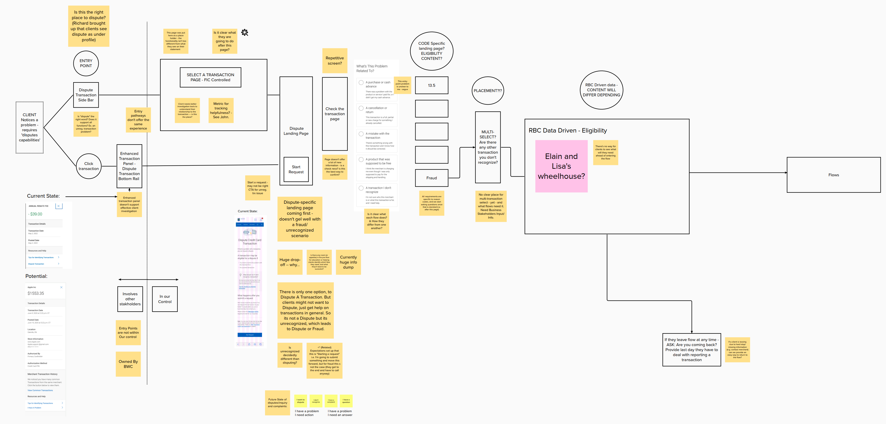
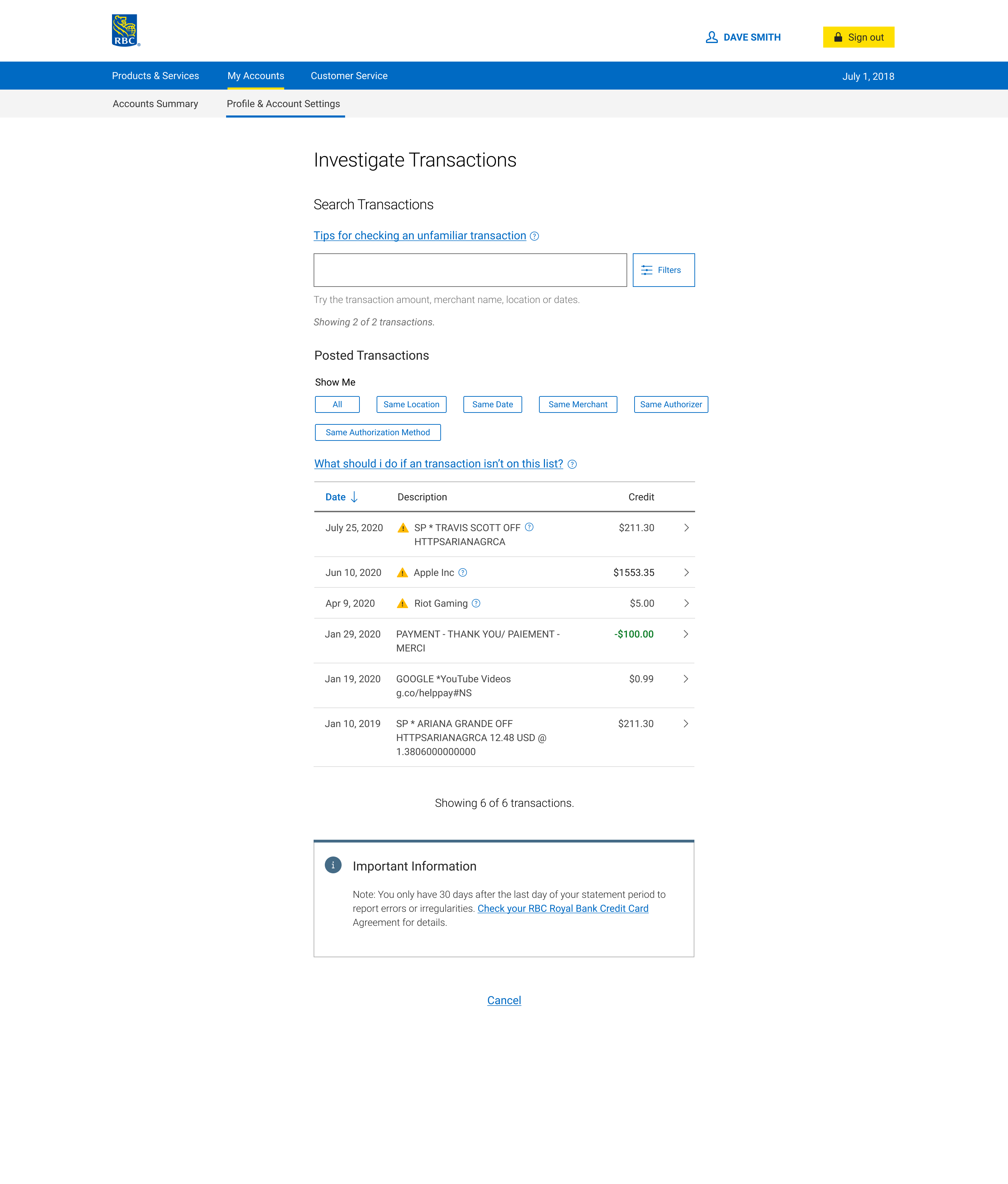
1. Change of copy from Dispute Credit Card Transaction to Investigate Transactions. This is because users are going into this flow to help them understand their transactions and their past with them, not necessarily to immediately dispute transactions.
2. The Transaction Panel currently doesn't offer much information for clients to recall their history with the selected transaction.'
3. The Select A Transaction page doesn't offer much to help users understand a transaction.
The MVP
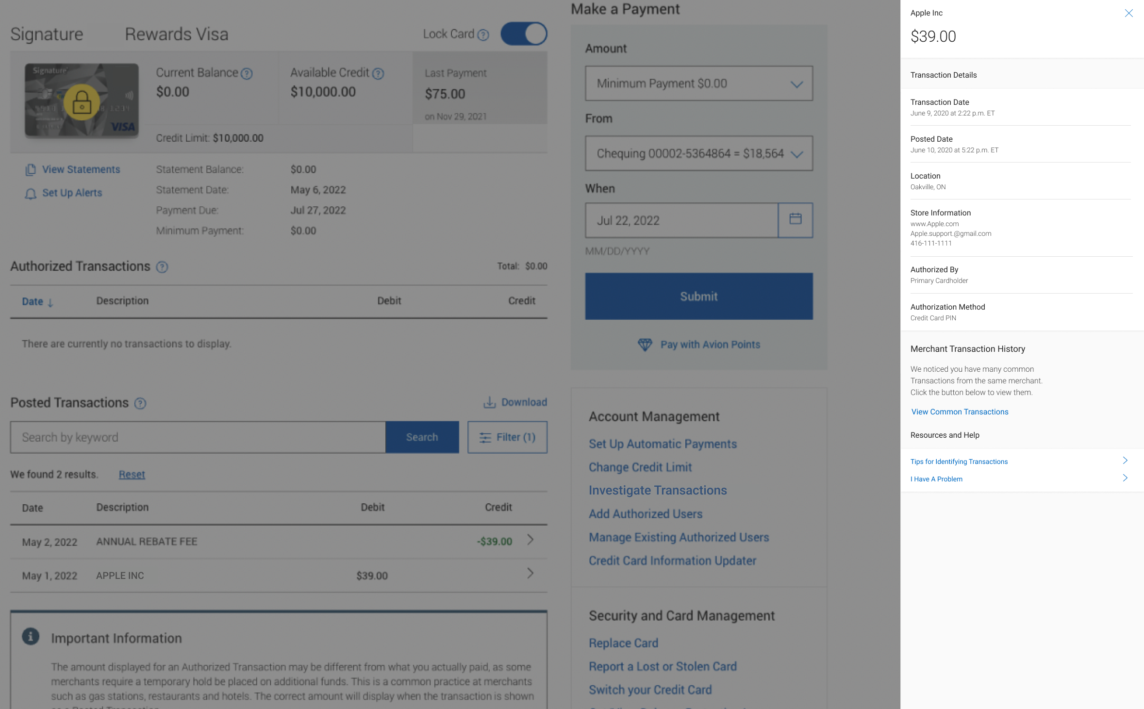
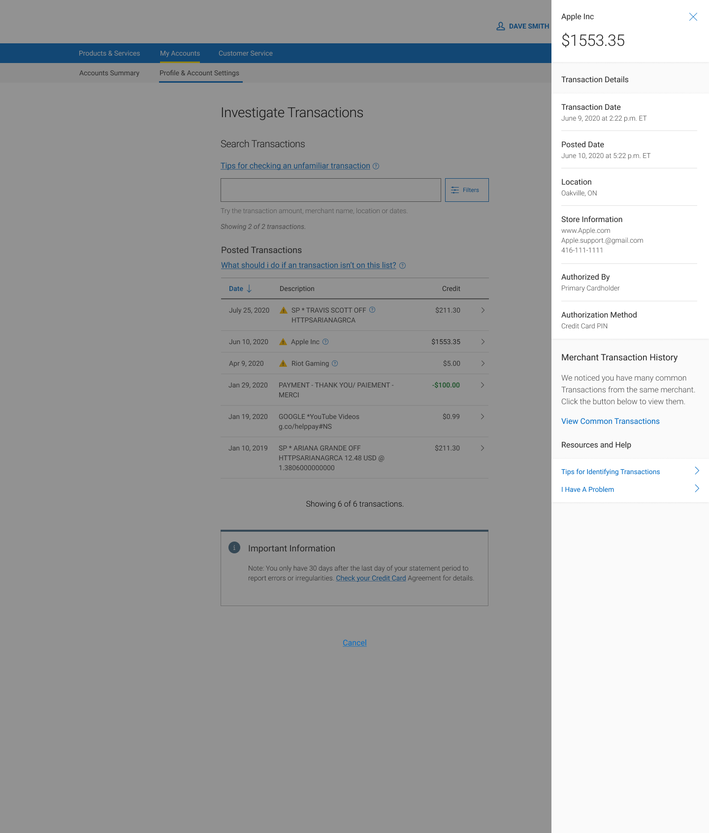
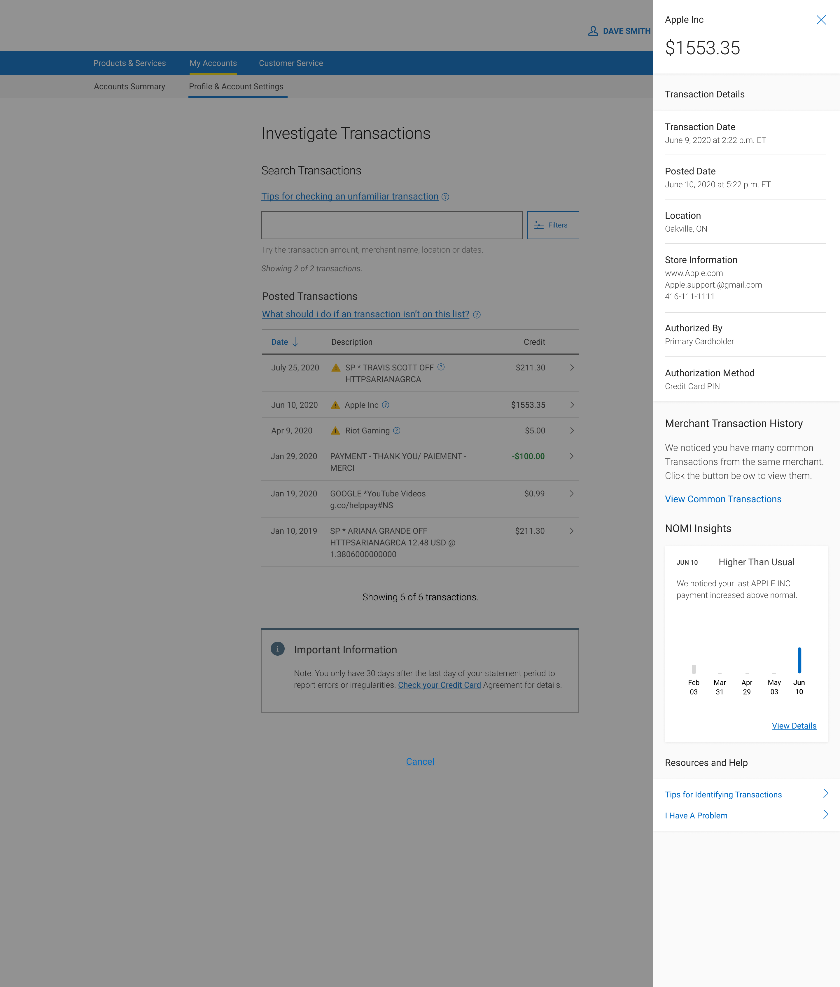
Enhanced Transactions Panel
From research, Location, Store Information, Authorization By and Method, Merchant Transaction History Info were added to the panel as i learned from research, users were unable to recall their purchases most of the time without these key fields in memory recognition.
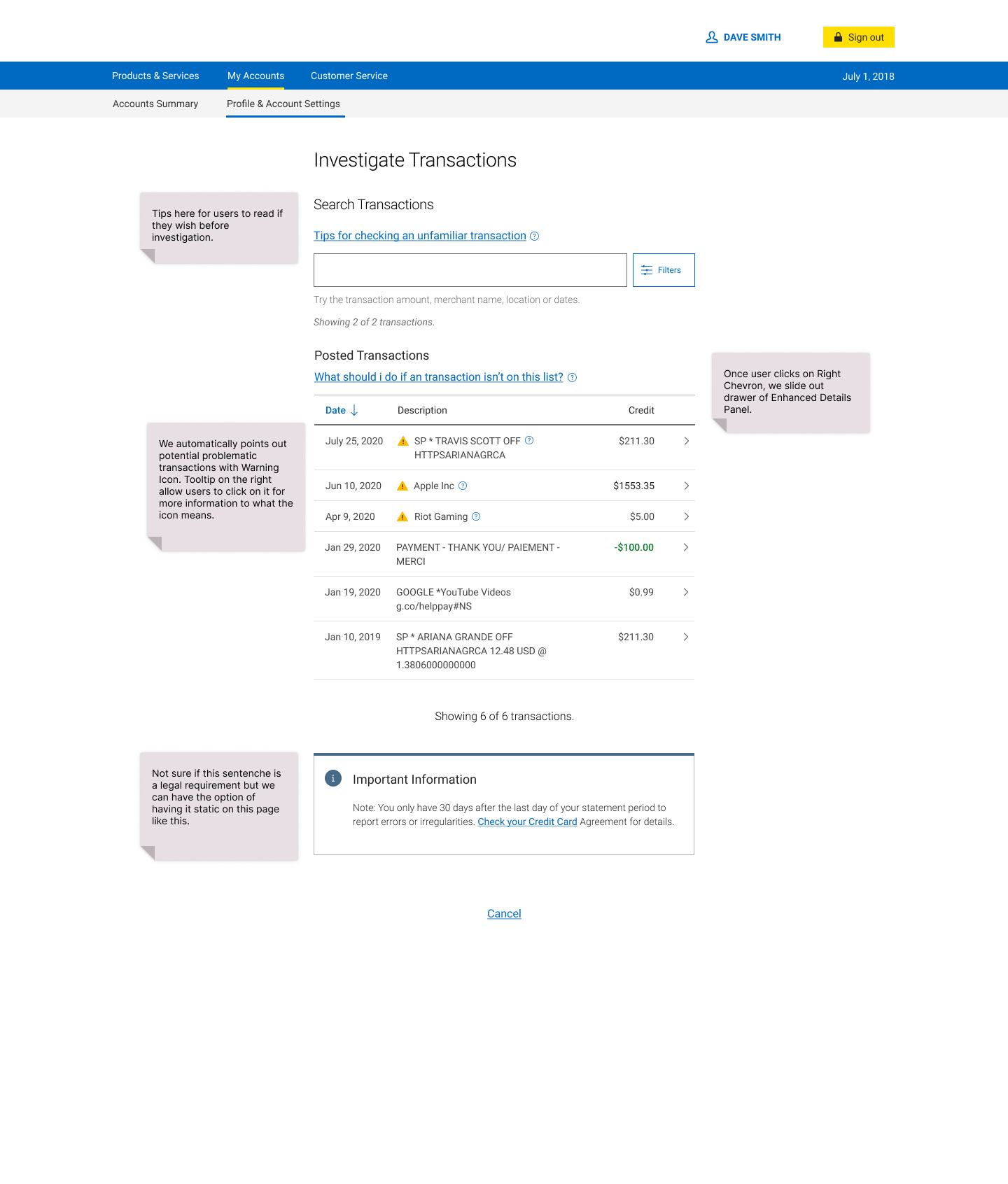
Transactions Page
I repurposed the screen to provide features that fit the users' mental model of investigation, recall and recognition of transactions and its history.
There are two sides to the coin here of discovering problems. The client on their own and RBC. RBC currently can text, app notification and automatically block client cards. However within the client self initiated discovery mental frame of looking at their statements habitually, we can identify / point out problematic transactions to them to help them look through their finances faster and more effectively.
To find potential fraud or disputable transactions. RBC should help clients identify problematic transactions automatically so that clients do not have to investigate on their own to realize something is wrong. This can be a huge user experience improvement to clients. This helps the client by reducing their need to self investigate with lot of effort, thus increasing their opinions/fondness of RBC, stop problems from brewing too long unnoticed and get solved ASAP, further preventing more damages to the client’s account/money and their perception of RBC.
The requirement of this from tech side is we need code that relates itself or the individual transactions to others within the database so it can call attention to transactions that break the pattern of a client’s spending patterns. Otherwise this won't work. (tech limitation possibly, need to confirm with dev and database).
The enhanced transaction panel will provide further details on each transaction for users to recall their history by providing the ability to look at all transactions made from a merchant to help them recall their history.
Actions from the panel include how to use the data points we provide them with Tips For Identifying Transactions Button here. If they feel after investigation there is a problem, they click on I Have A Problem button to go into Triage flow.
Our backend database categorizes purchases into Category codes, which i created as filters here, so when user clicks it shows only the category purchases.
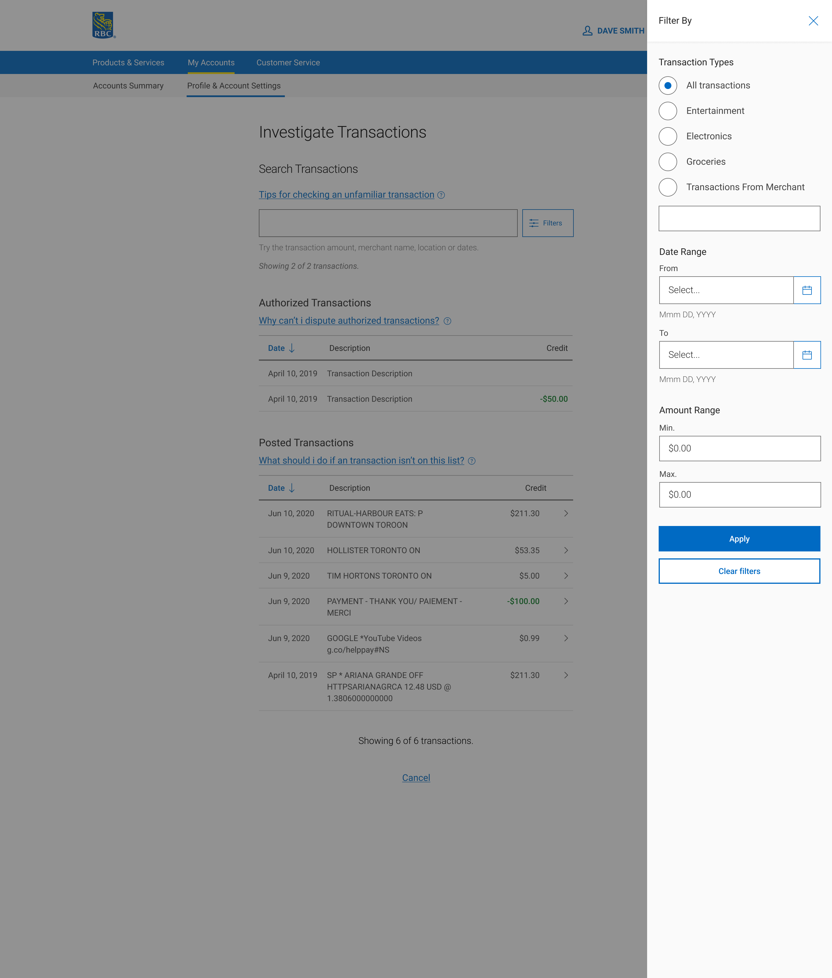
We have a budgeting tool as well, there is the possibility of incorporating some elements of it within the panel as well. Such as budget trackers of each merchant to help the user identify when a transaction breaks their typical purchase pattern for that merchant.
I played around with the idea of having category filters on the transaction page itself for ease of access to filter the transactions lists quickly and without having to pull out a slide panel. This was the final design that was approved.
Next Steps
I worked with the development team and their database architects to scope out the work to do this. After the took in the designs, they will then create the requirements on the technical end to create this new experience. In terms of the second part of this flow, the self serve questionnaire, that is currently put on hold as the leadership has decided to dedicate all resources on this project to building out this Investigation experience first.
Next Steps
After i completed the main focus of the project, i onboarded the team that will be handling the second part of the process with my work. They will be working on the flow that continues on after the user has identified the problematic transaction here, the self serve flow. I have increased users ease of finding problems, speeds of doing so and offered a smooth experience in taking them into the reporting problems flow, which we need to improve overall since our current flow is not used by most users, they just call support instead and give up during the flow.